Compositions
Four Compositions
In this task I had to photograph 4 types of composition
Composition types
The 4 composition types we had to capture were layers, rule of thirds, balance and triangles.

Thirds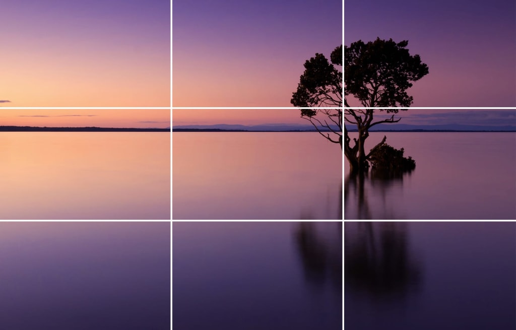
Triangle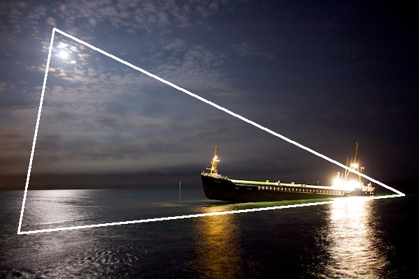
|
Balance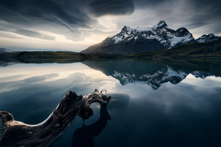
Layers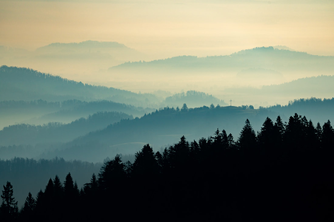
|
Rule of thirds: By placing the subject on third grid lines it makes the image more interesting
Layers: Having 3 distinct layers in the same photo.
Balance: Having the subjects placed equally as if on a scale.
Triangles. Creating triangles within the image.
Layers: Having 3 distinct layers in the same photo.
Balance: Having the subjects placed equally as if on a scale.
Triangles. Creating triangles within the image.
These are photos of my composition designs.
School
Original photos
The are the unedited photos of my compositions from school.
Edits
Triangle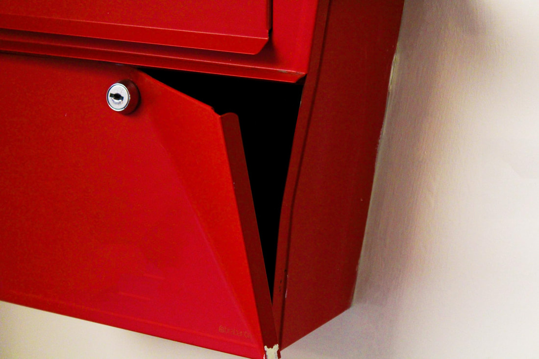
For this composition we had to try and find triangles within the image.
|
Thirds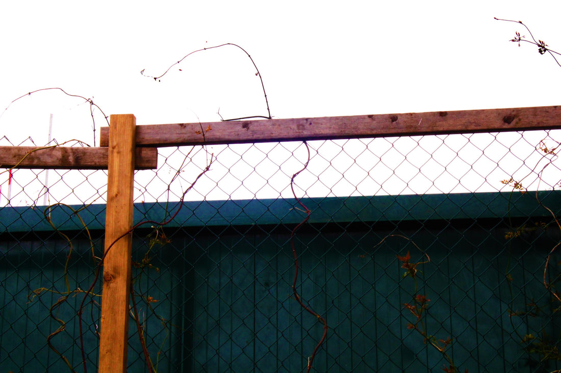
The rule of thirds is when your subject is along third grid lines rather than in the middle.
|
Layers
|
Balance
|
|
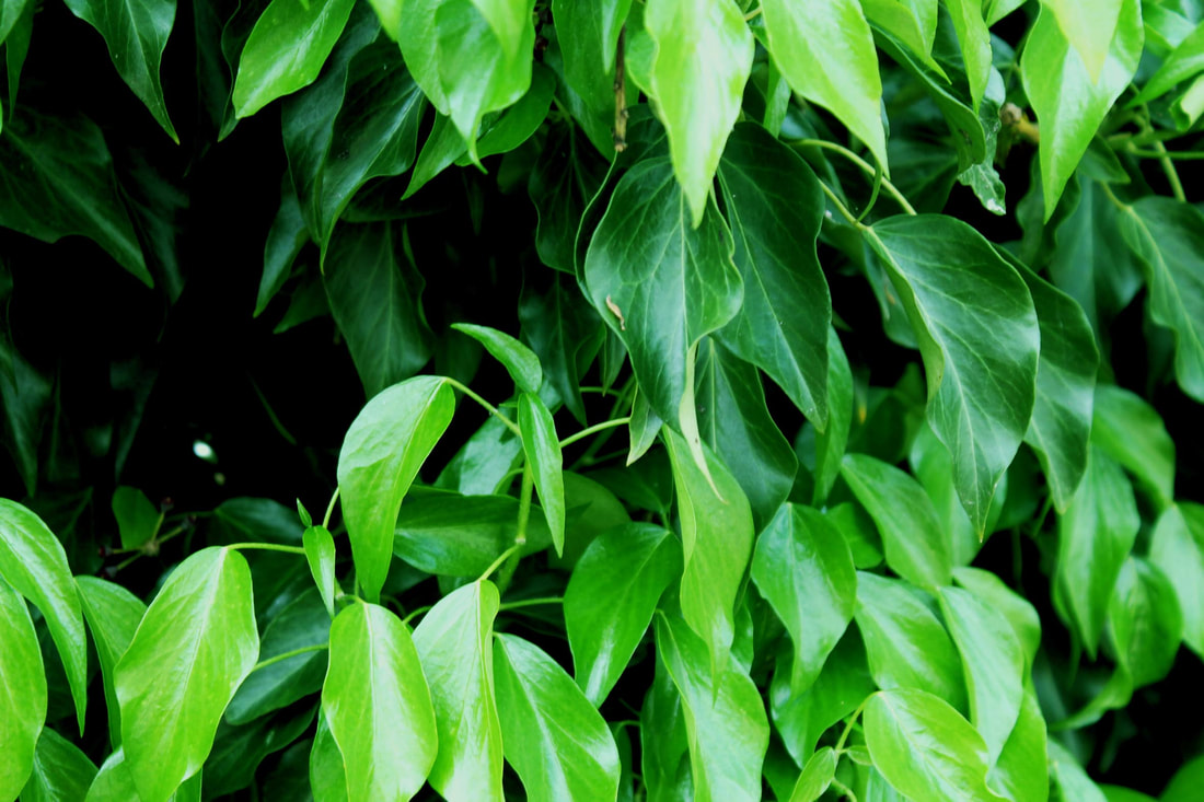
In this composition we had to capture clear layers.
|
This composition was about balancing the subjects of the photo.
|
WWW- I captured most of the compositions clearly.
EBI- I had made them look more like the designs.
EBI- I had made them look more like the designs.
Home
Originals
Unedited compositions from home.
Edits
Triangle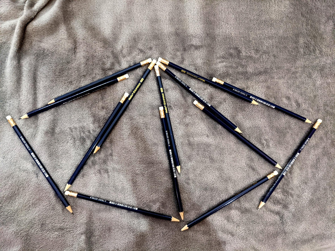
This was my triangles edit but the composition wasn't very good.
|
Thirds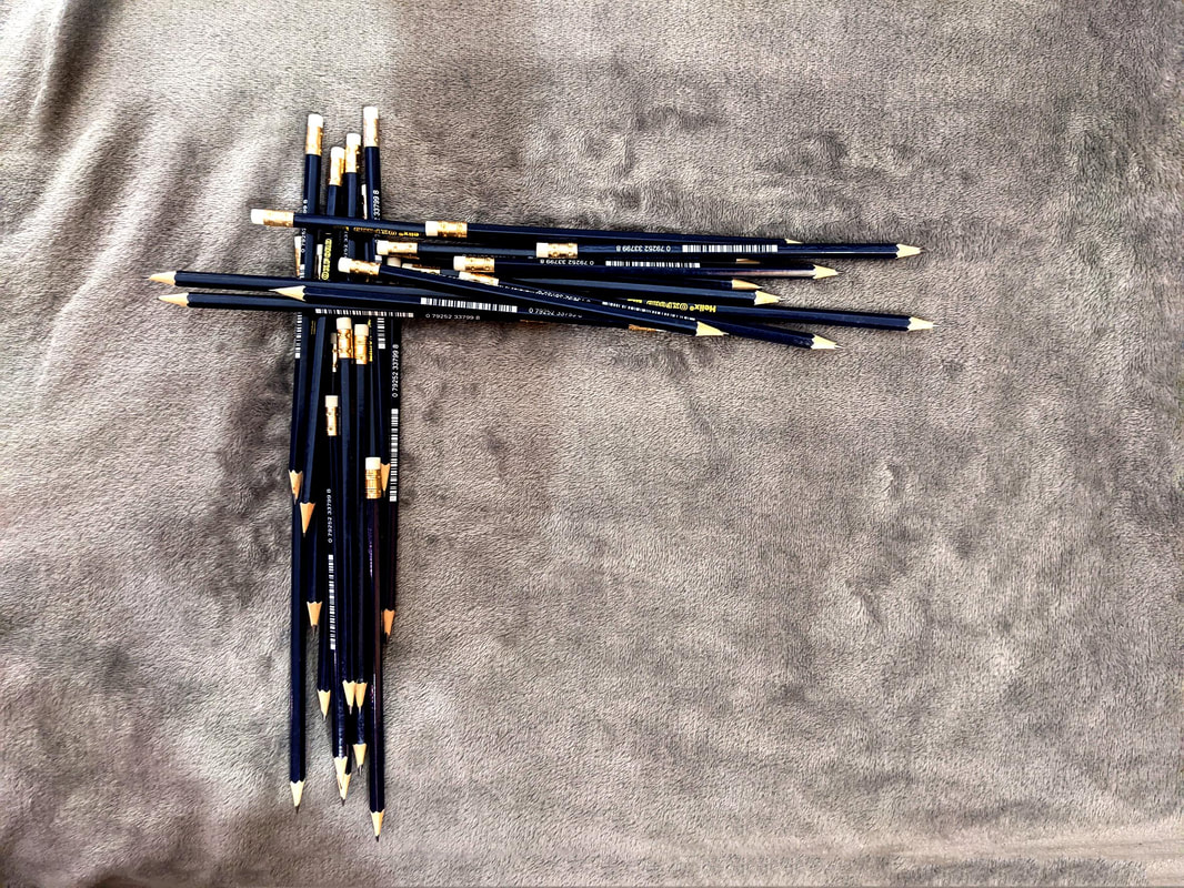
Again this was my thirds and it's rather unimpressive.
|
Layers
This was my layers composition and i made it out of different coloured t-shirts.
|
Balance
This one was balance and i used old marmite jars to create show the objective.
|
WWW- The edit on the balance composition was done well.
EBI- I had improved the triangles and thirds compositions.
EBI- I had improved the triangles and thirds compositions.
Best Overall
Triangle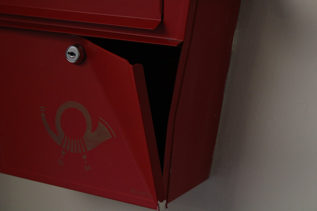
Layers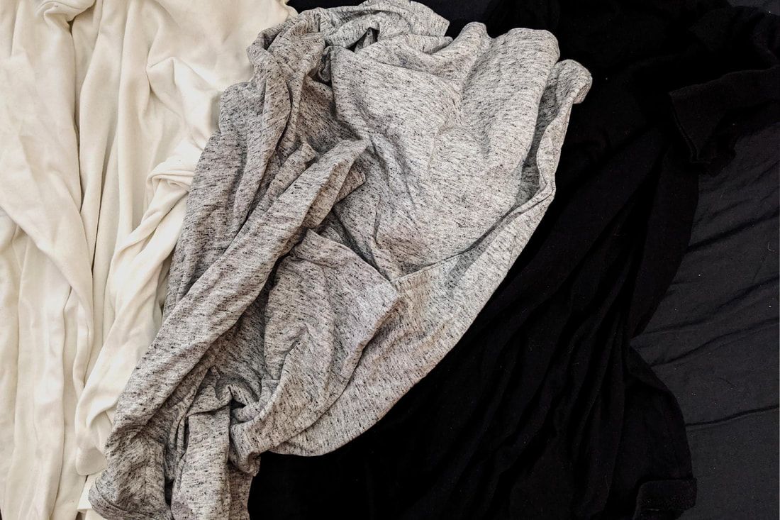
|
Balance
Thirds
|
These were my overall best compositions my favourite of which is the balance as I like the way its been completely changed in photoshop but it doesn't look over edited.
Framing
Using mirrors
In this task we use a mirror to reflect a different image to the area we were photographing.
Original Photos
My first attempt unedited.
As you can see some went better than others but overall it was a decent first attempt.
Edits
My 4 best attempts edited.
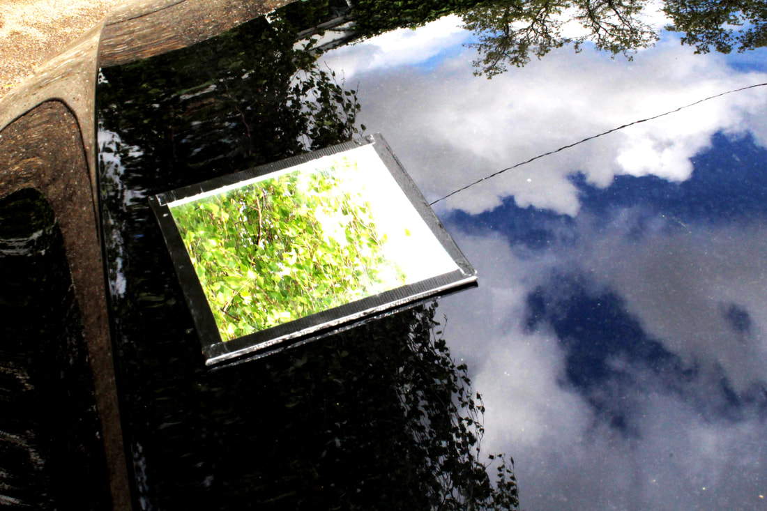
I took this one on the bonnet of a car (Golf GTI) and I thought it worked well as the paint is also reflective so you get 3 different images.
|
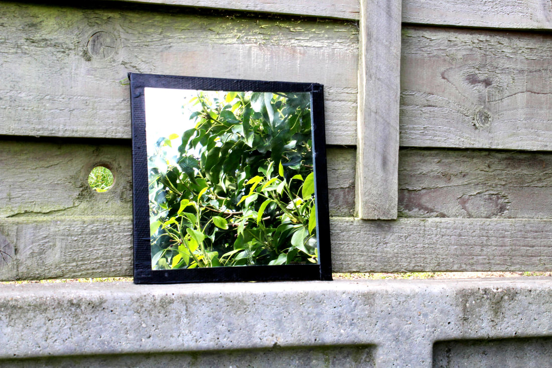
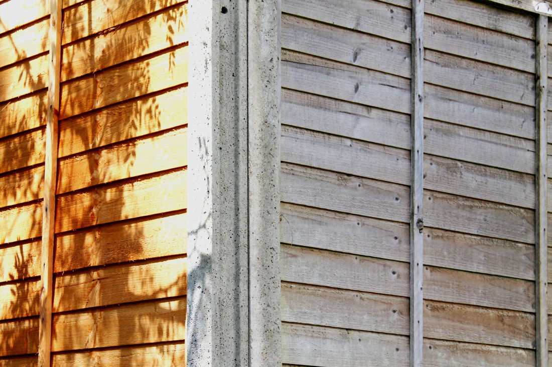
This was taken on a fence and I like it as it shows greenery and life on a dull, grey fence.
|
This was taken inside a classroom and there was an issue with the depth of field but I like how it turned out as it shows almost like a window in the blur.
|
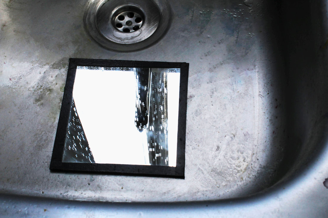
This was my first attempt and whilst it isn't the best you can see the running water which I like.
|
WWW- I managed to capture the contents in the mirror well and I liked the result.
EBI- I had captured the surrounding better in some of the photos.
EBI- I had captured the surrounding better in some of the photos.
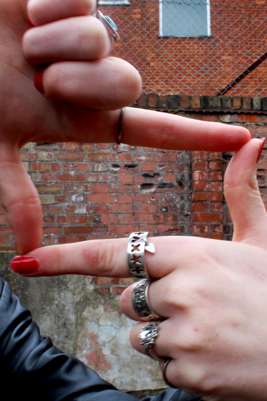
Finger Frames
In this task we were experimenting with depth of field by looking at our subject through finger frames and photographing with various apertures by changing the f-stop on the camera.
How do you capture different depths of field- shallow and extensive?
How do you capture different depths of field- shallow and extensive?
First Attempts
These were my first attempts and they went pretty well.
Best Edits
My best attempt edited.
Aperture - F4.5
|
Aperture - F11
|
Aperture - F22
|
WWW- Composition shows changes in aperture well. Strong composition
EBI- I had just captured the finger frame and not her arm.
EBI- I had just captured the finger frame and not her arm.
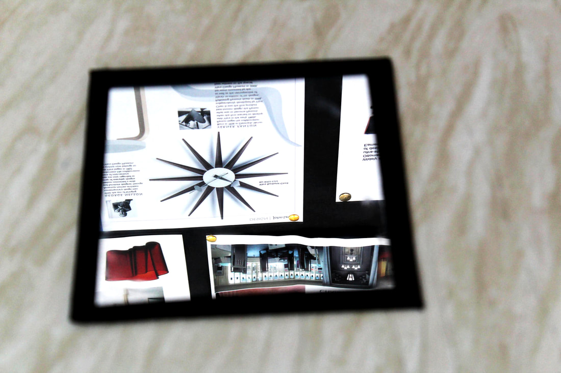
Framing Details
In this task we used a paper frame to highlight details in an image.
First attempts
My first try at using the paper frames went fairly well and I like the first one most.
Best Edits
My best attempts edited.
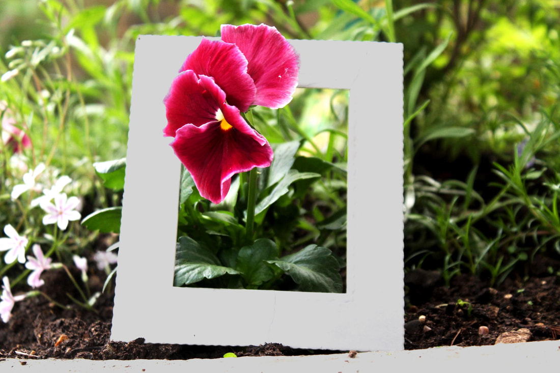
This was my best photo and I'm pleased with the end result as the flower coming through the fame adds depth to the photo.
|
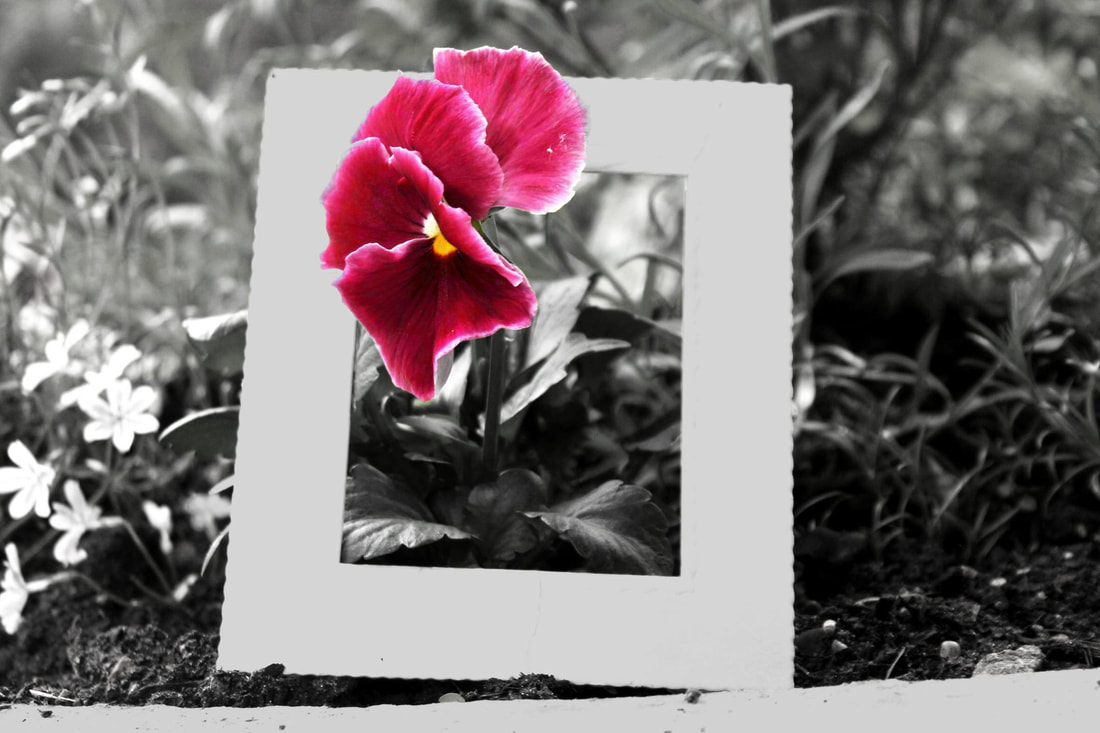
I like this photo because by under-saturating it the flower looks as if its the only living thing.
|
WWW- The edits turned out well and i captured the subject well.
EBI- I had straightened out my frame and didn't capture the edge of the pot.
EBI- I had straightened out my frame and didn't capture the edge of the pot.
Aspects of Photography
Formal Elements
In this task we experimented with the formal elements of photography which are colour, contrast, tone, pattern, texture, line and form.
Original photos
The unedited photos from my first few tries at capturing the formal elements.
Edits
These were my best tries edited. Can you label the separate images with what element they are.
Best Ones
Some of my photos were overall better and these are my favourite one.
I like this as it shows a wide range of colours in an interesting way.
|
I chose this one as it shows different tones of green on the same tree.
|
This one is good as it displays contrast in a slightly more unusual fashion.
|
WWW- Some of my examples turned out very well and show their element clearly.
EBI- I had spent my time equally as some examples didn't turn out as well.
EBI- I had spent my time equally as some examples didn't turn out as well.
Windows
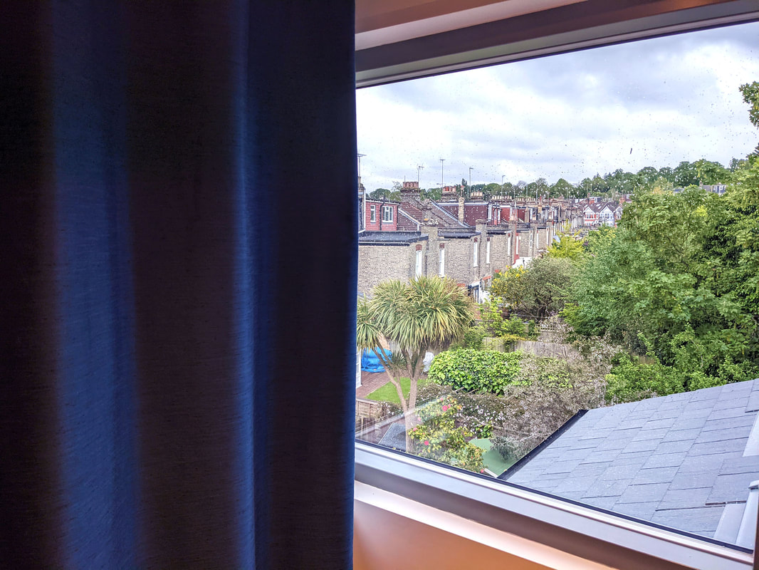
In this task I had to photograph through a window which acts as a filter since it blocks a large portion of the outside.
How did you interpret the task?
How did you interpret the task?
Unedited Photos
My photos of the windows.
Edits
My best photos edited.

|
|
WWW- The view from the windows I photographed looks really god and captures a lot scenery.
EBI- I had tried again at a different time to capture it at night and mid day to show contrast.
EBI- I had tried again at a different time to capture it at night and mid day to show contrast.
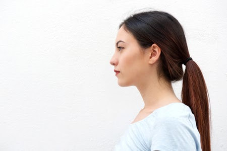
Workshop 1: Mirroring
One of my composition photos mirrored (put the original image on the left)
Original
The original photo taken from my first composition task.
|
Mirrored and Edited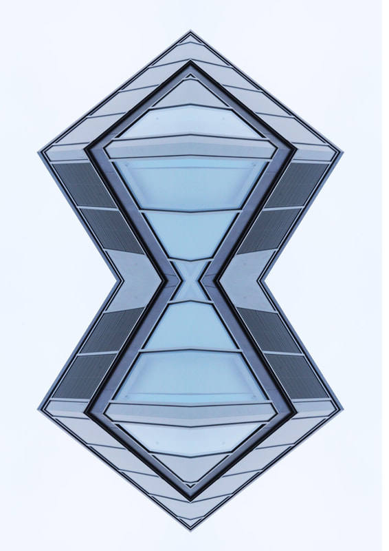
The photo after it was edited and mirrored across the x and y.
|
This technique is interesting as a repeated image can look like something completely different all together, however I don't think I'd use it in my independent work as it requires the image to have certain properties which could limit the content.
WWW- The image i selected worked well being mirrored.
EBI- I had chose an image with a more interesting background.
What are your thoughts on this technique? Do you think you might use this process? How successful do you think you were in creating a mirrored image?
WWW- The image i selected worked well being mirrored.
EBI- I had chose an image with a more interesting background.
What are your thoughts on this technique? Do you think you might use this process? How successful do you think you were in creating a mirrored image?
Workshop 2: Double Exposures
Layering 2 photos into one image
Original Photos
|
|
Blended Photos
WWW- It was a decent first try as you can see both layers.
EBI- I had been able to remove the rest of the landscape completely.
EBI- I had been able to remove the rest of the landscape completely.
Independent Development
My independent work on some of my favourite photographers.
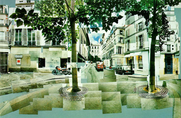
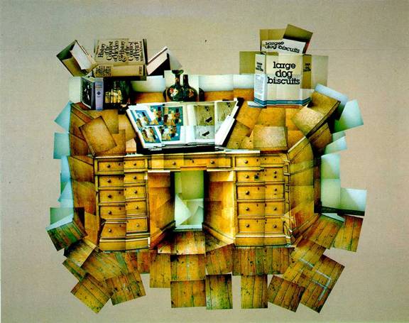
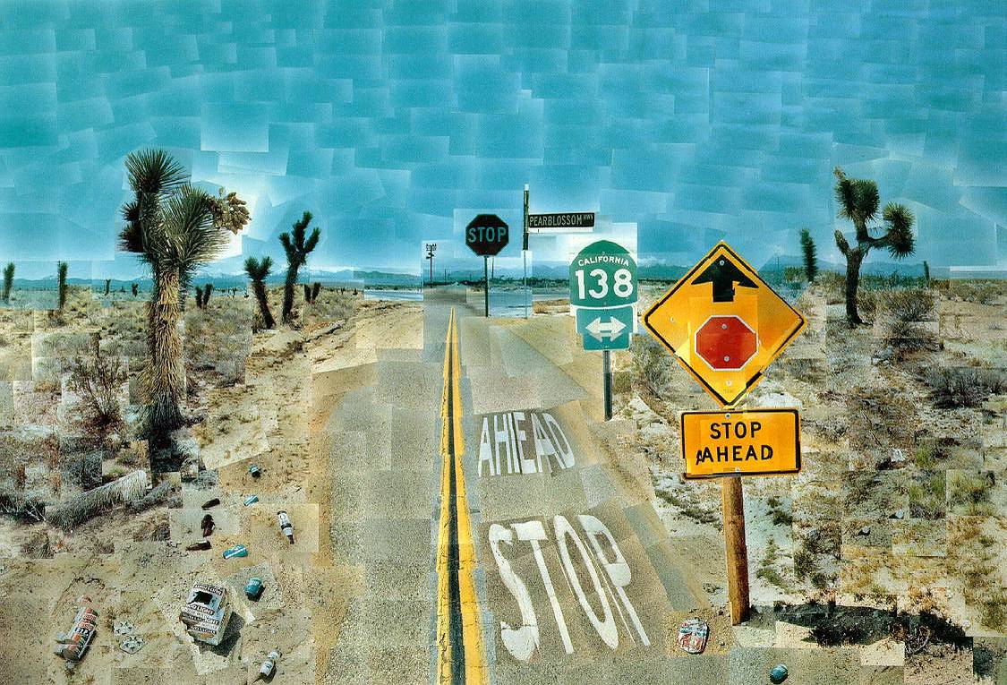
David Hockney
David Hockney is famous for his photo joiners which is a compilation of images of the same subject
Examples of Hockney Photo-joiners
These are some examples of David Hockney's work, I like these because they are irregular images of regular things and makes you look twice at something as mundane as a desk.
|
|
|
Analysis

The Desk, 1/7/1984
In this photo Hockney has photographed a desk using many photos of different parts of the desk which fits together like a jigsaw puzzle. I think Hockney intended to show how simple objects that could be considered dull can actually be interesting by using certain techniques. He did this by making it inherently un-neat as the floor doesn't quite fit and it looks as if the desk is a trapezium, this makes the image more eye-catching. He wanted us to really look into the image rather than just glance over it which most would do with a picture of a desk.
David Hockney is considering that people move faster and tend to be less patient in this piece. This is shown in the image as it takes a moment to figure out what the picture is almost like its trying to draw you in. He wanted to explore what he could create out of a simple subject to make it more interesting and complex.
Hockney has pieced together each photo to create the overall image. This creates an sense of intentional imperfection as not every photo joins up quite right. this helps support his point about how everyday objects can be more interesting than they seem.
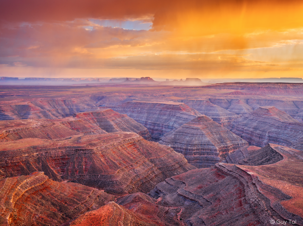
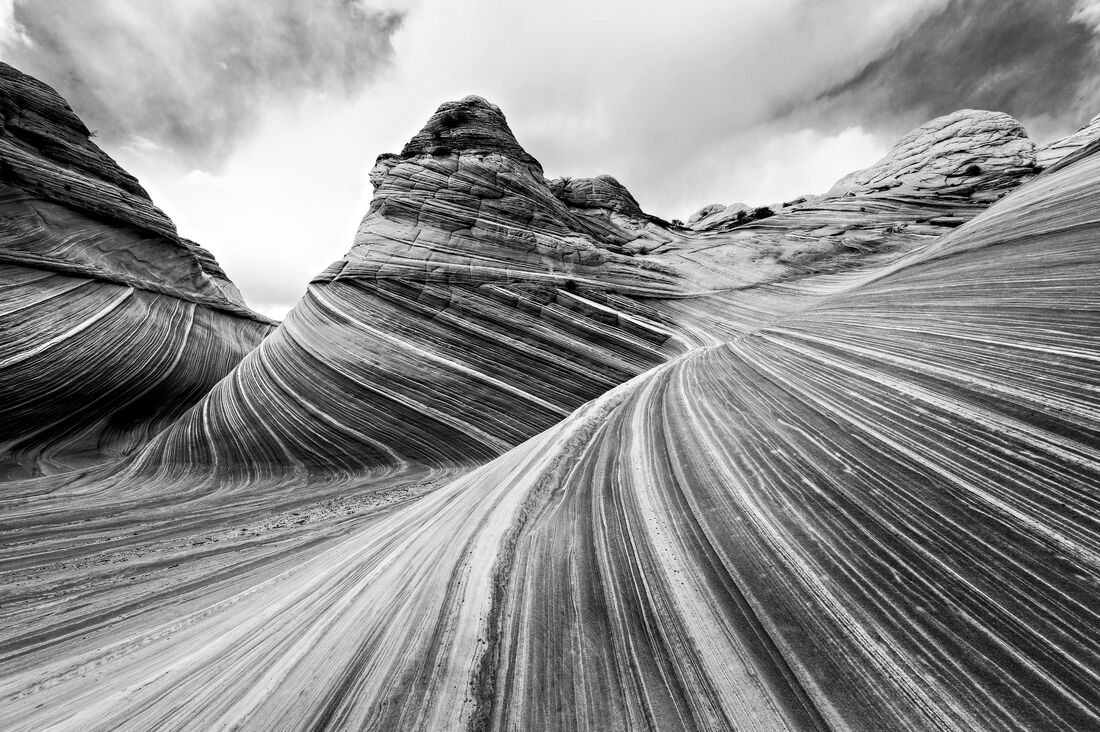
Guy Tal
Guy Tal is known for his over saturated images of vast landscapes.
Examples of Guy Tal Saturated Landscapes
Here are a few examples of Tal's work, I like his style as he uses photoshop to create really vivid colours of beautiful scenery.

|

|
|
Analysis
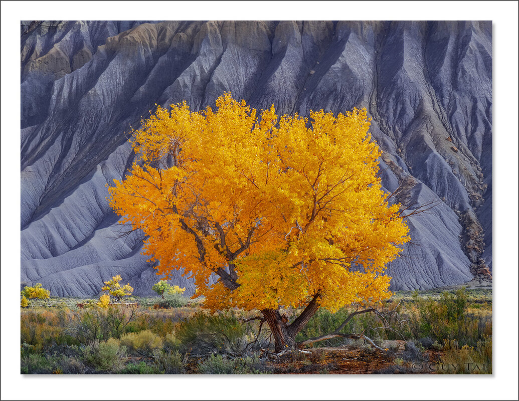
Better than Gold, 23/12/2018
In the image Guy Tal has made the tree really bright and vivid whilst making the cliff face behind it really dull and un-exciting. I think he intended to create layers in this photograph by making the tree stand out which separates it from the ground and then the cliffs behind adds the third layer. He wanted us to look into the image and look at each layer individually.
Guy Tal is highlighting that there's more to a photo than just the subject. He does this by having all the image in focus so you can see all the details in frame. He wanted to explore what he could capture outside of the subject.
Guy Tal has used layers in creating his work. This creates an effect of depth to the photo which helps to covey his point about making us look into the photo rather than just glancing at it.
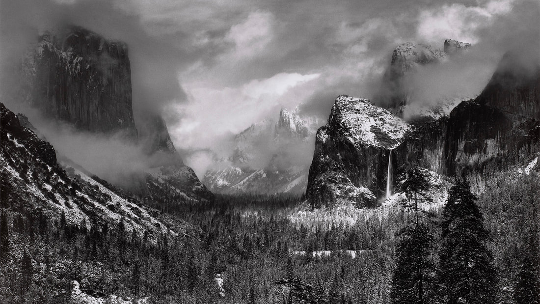
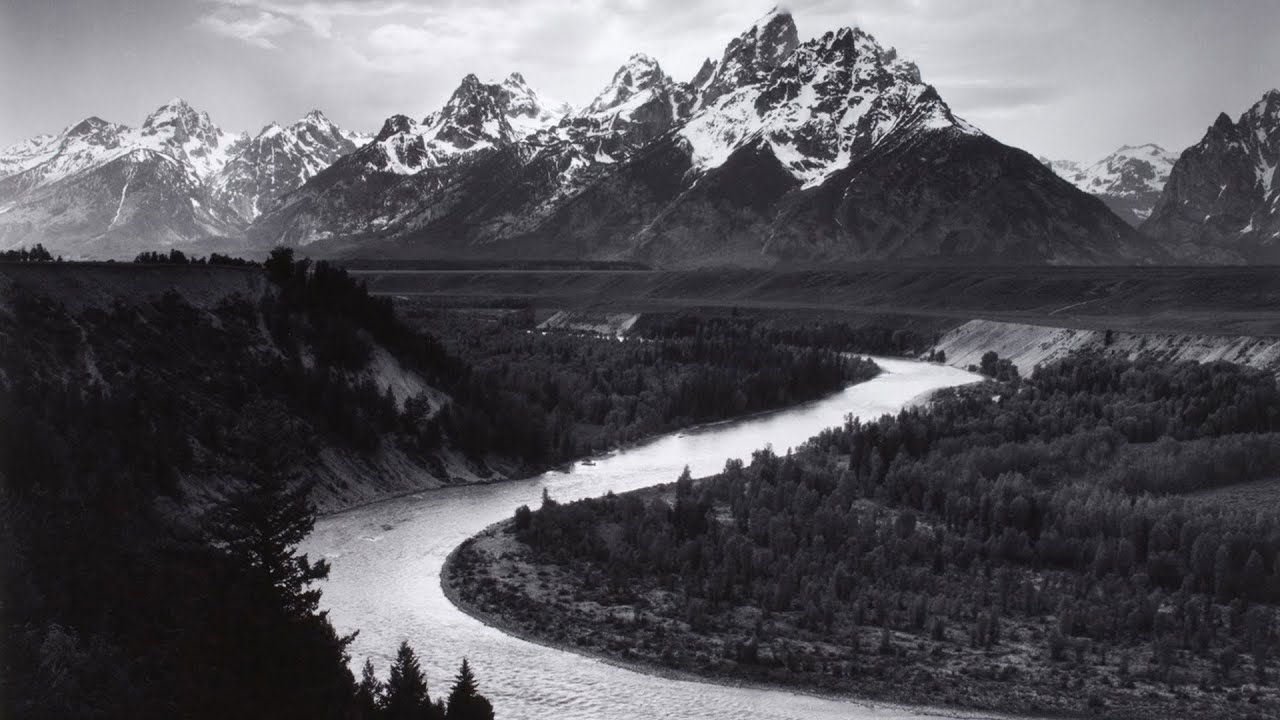
Ansel Adams
Ansel Adams is known for photographing striking landscapes of huge American scenery.
Examples of Ansel Adams Landcapes
Some examples of Ansel Adams' breathtaking landscapes
|
|
|
Analysis
Clearing Winter Storm, Yosemite Valley, 1937
In this photograph Ansel Adams has captured Yosemite valley as a storm was clearing and is a spectacular landscape. I think he intended to show the shear scale and beauty of Yosemite. He did this by photographing in a position that allows us to see so much of the valley. He wanted us to react by just being immersed by the amazing scenery.
Ansel Adams is considering our changing world in this piece. I think this because he captured Yosemite nearly 100 years ago and we can forever compare what it looks like now to how it did in 1937. He wanted us to remember how the world natural world used to and should always look like.
Ansel Adams has chosen to photograph in black in white when creating this work. This helps show the size of the valley, which helps reinforce his point about how immersive the landscape is as it draws attention to the cliff faces emerging from the fog.
Response to Guy Tal
I chose to respond to Guy Tal as his work interests me and I thought it could be fun playing with photoshop to over saturate elements of the photograph.
First Response
My first go at creating Guy Tal inspired photos.
School
Original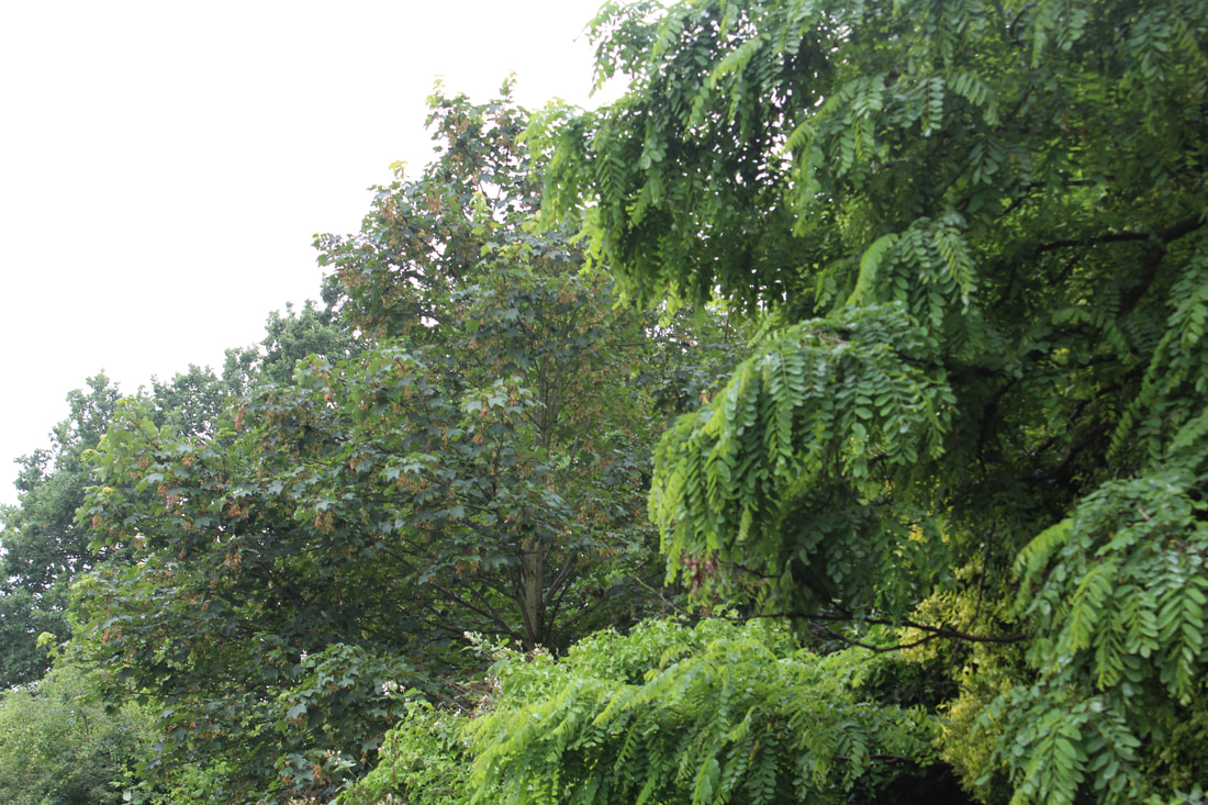
I thought this would be good to use as it has many tones of green so each tree would look different saturated.
|
Edited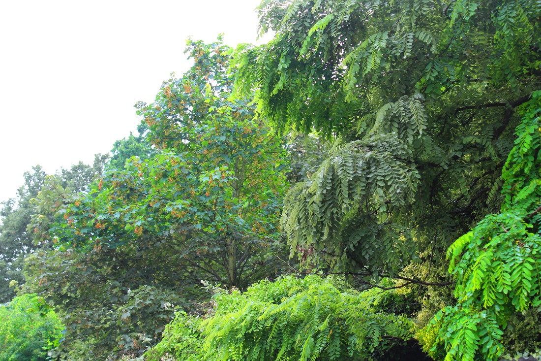
I like how it turned out as the trees look much brighter and have much more vivid colours.
|
Outside
Original
This is the view from Muswell Hill road looking towards highgate woods. I chose it as it is one of my favourite views and theres a layer effect from the road, the woods and the sky.
|
Edited
I've edited it by saturating and un-saturating certain subjects in the photo, which I think makes it a more interesting piece as you have to look into the image rather than just glancing at it.
|
Second Response
Countryside
Original
This is my original photo of a paddock in Sussex. I chose this as it shows a good contrast between city and countryside
|
Edited
In my edit I used a different technique for altering the saturation and colour balance and I'm happy with the result as it's a much better landscape and it's a much better edit.
|
London
Original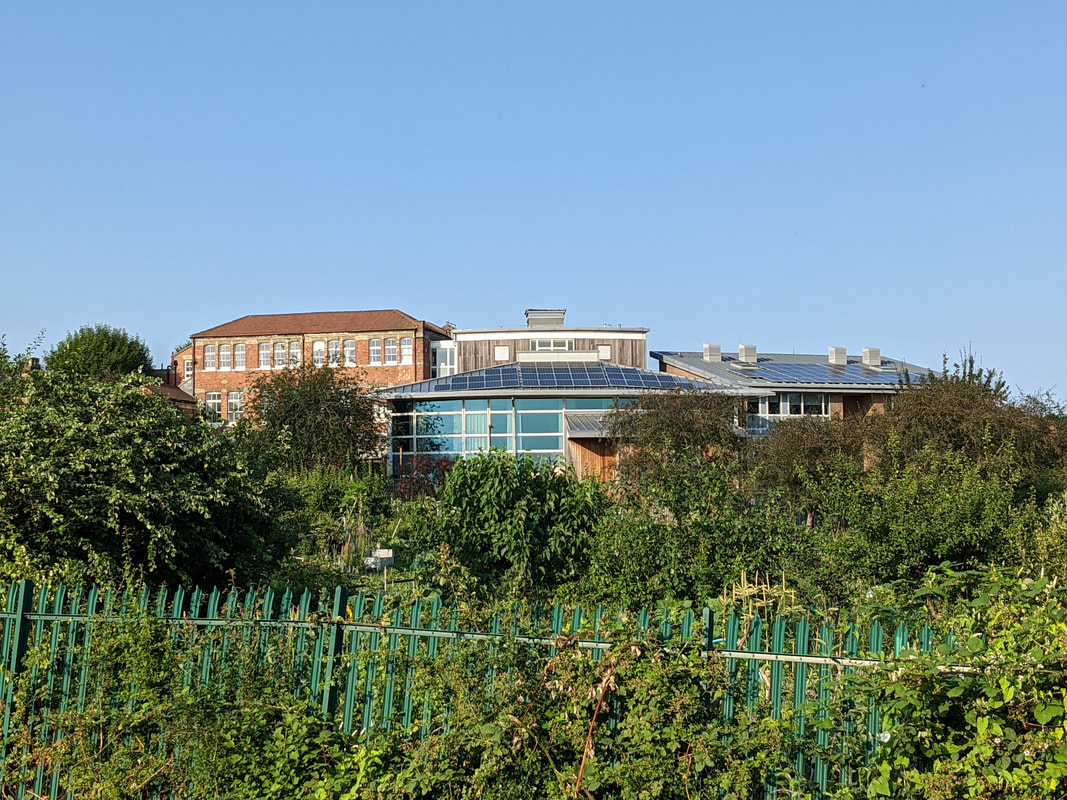
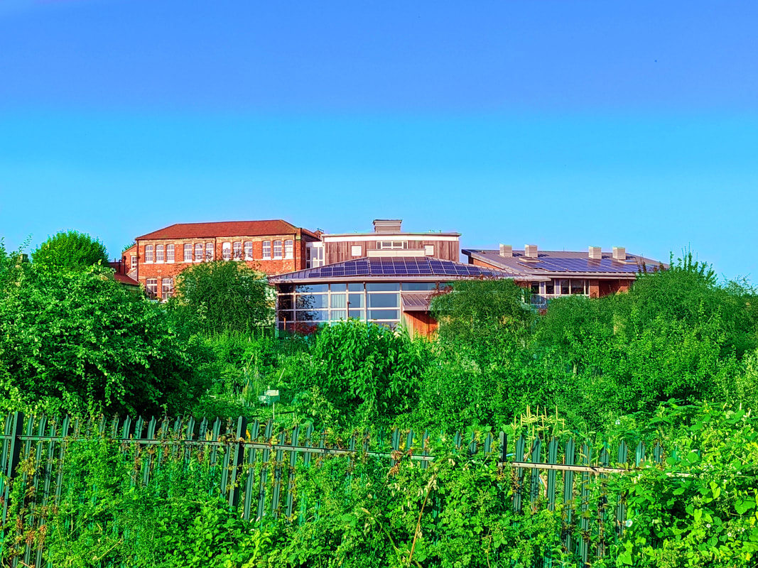
Previously I wanted to explore London to find more interesting views and this was my first attempt. By photographing Tetherdown school from a unique location I was able to use layers to make a better picture.
|
Edited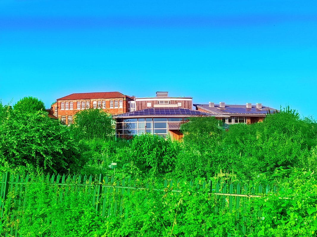
In my edit I really wanted the allotments to stand out so they contrasted well with the sky and the school makes for an interesting layers pattern.
|
WWW- Overall I am pleased with the end result and I think my second attempt went much better and there's a clear level of development.
EBI- My edits had been cleaner and looked better.
EBI- My edits had been cleaner and looked better.
Response to Richard Mosse
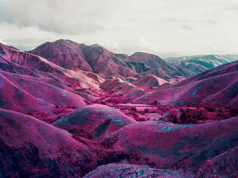
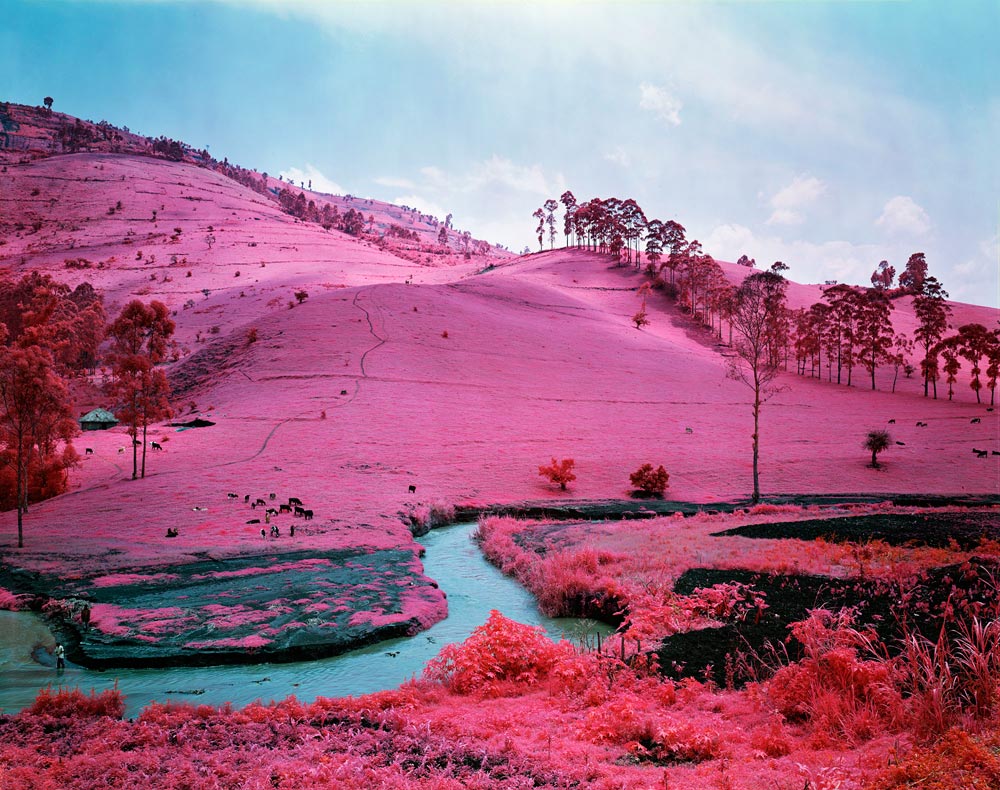
This is my response to Richard Mosse who was known for editing phots of the Congo landscape and completely changing the colour of the terrain.
Examples of Richard Mosse
|
|
First Response
Original
|
Edit
|
This was my first response to Richard Mosse and it turned out decently however I think there is definately room for improvement.
Second Response
Original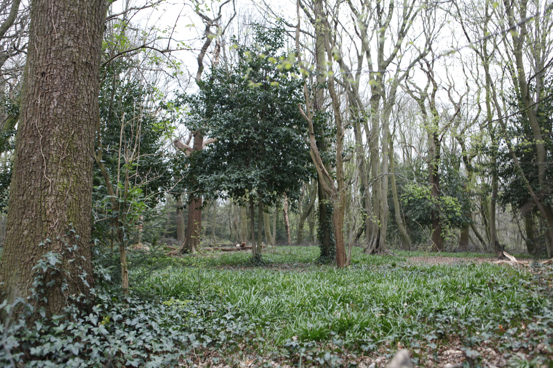
This was the original for my piece I wanted to get a tree on its own for my penultimate response.
|
Edit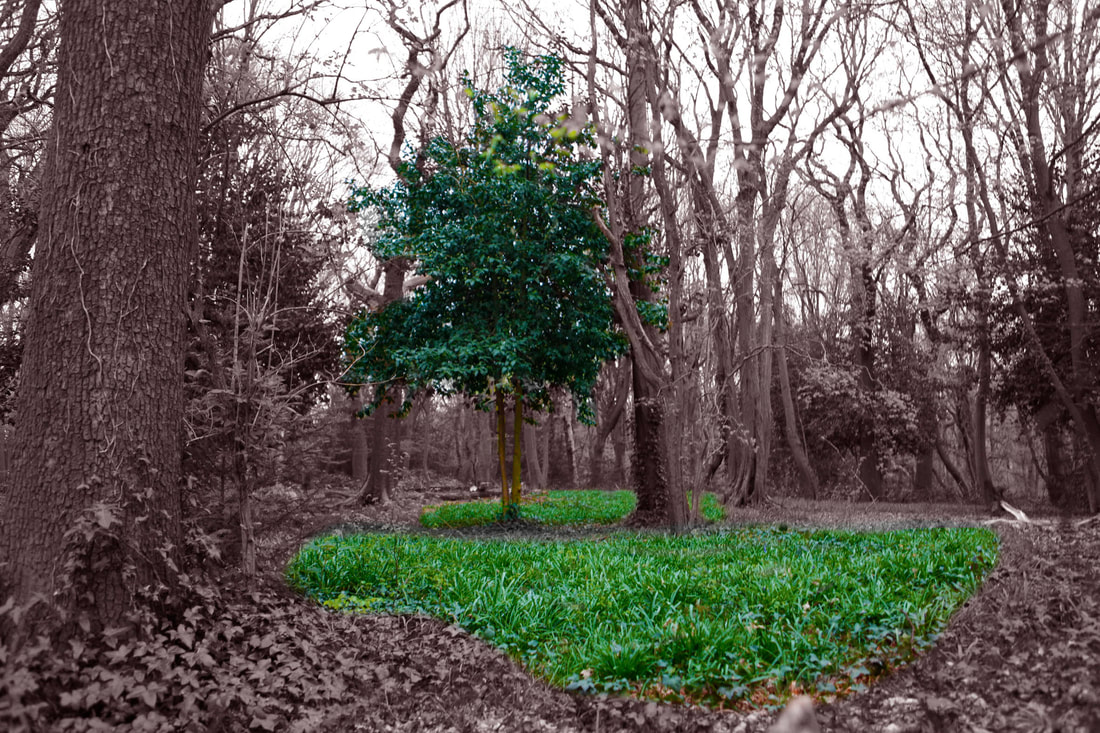
In my final edit I wanted to have a point to my photographs so i isolated the tree and made the surroundings look as if they were dead. I did this to show the impacts that climate change would have if we don't try to prevent it by making it appear as the last tree not yet taken over.
|
Final Response
Original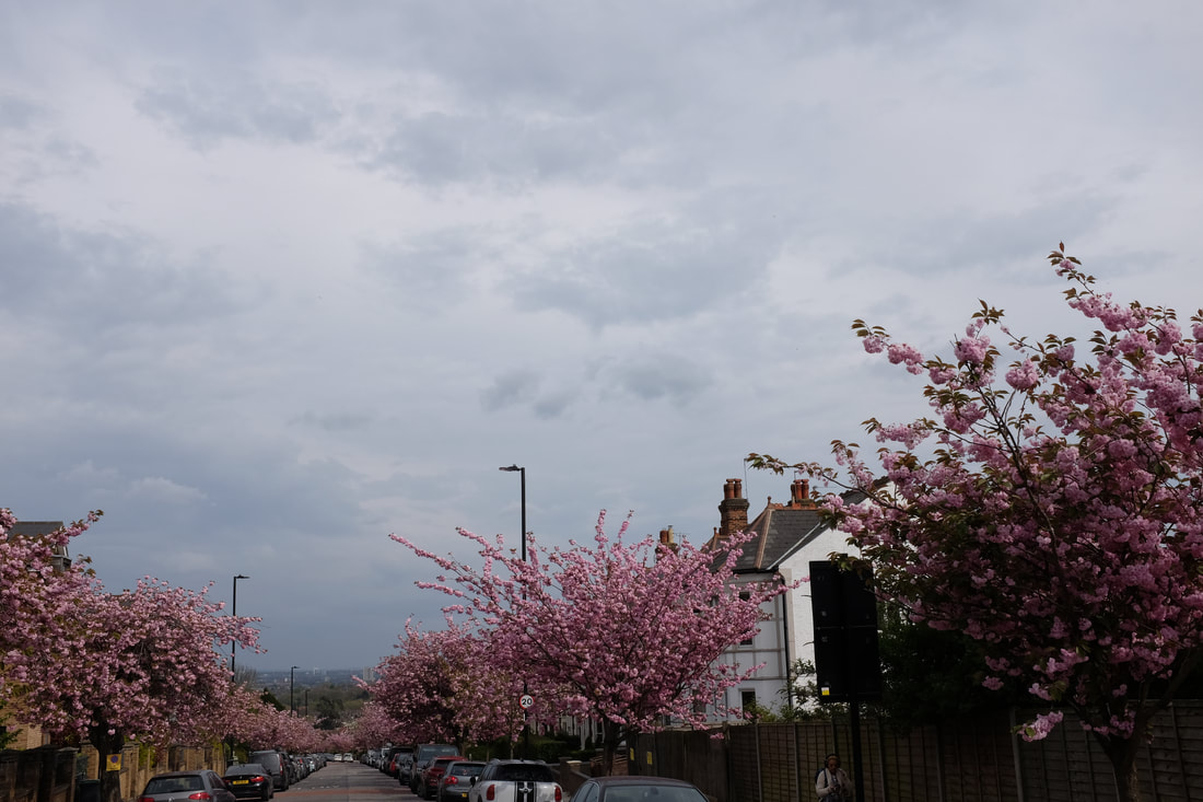
For my final response I took photos of the blossoms from the top of Cranley Gardens. I wanted to capture mainly tree and sky whilst incorporating balance, rule of thirds and layers.
|
Edit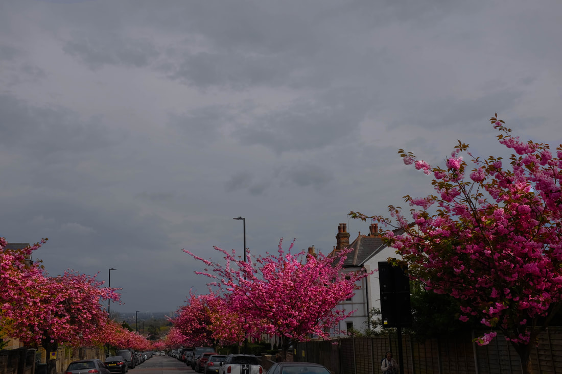
In my edit I wanted the trees to be the most and only vibrant objects in the photo. I amplified their colour and dulled the surroundings using layer masks and I am Pleased with my result.
|
WWW- Overall I'm pleased with how the editing went and i found some more interesting photos.
EBI- I had found a more interesting location for my first response.
EBI- I had found a more interesting location for my first response.
Final Pieces
|
|
|
