Robert Holden - Burning House Project
In 2015 photographer called Robert Holden began project where people would submit photos of what they would take with them if their house was on fire. The idea was you could learn a lot about a person from the 10 or so items they would bring with them. For example if someone put all their valuables you could tell that they were materialistic.
Here are a few different examples
|
|
|
|
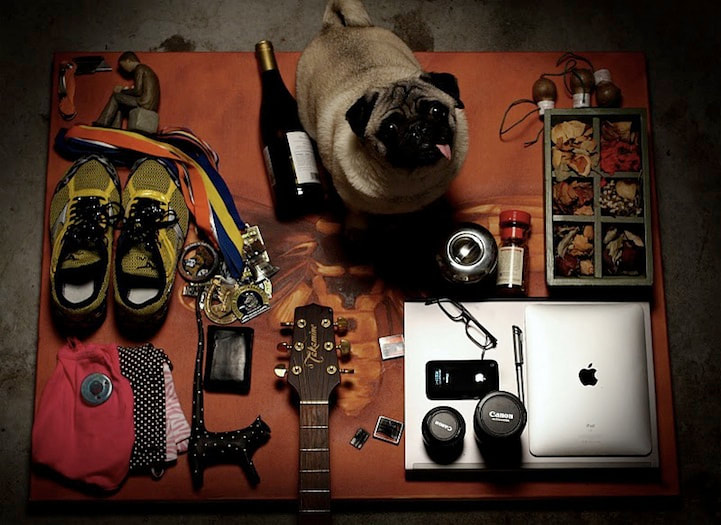
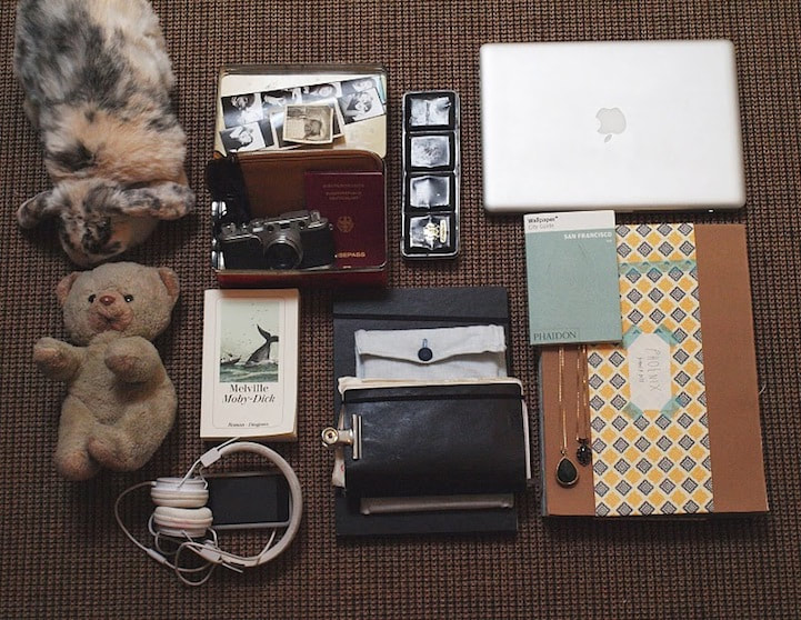
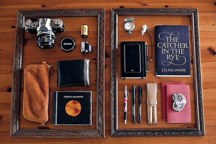
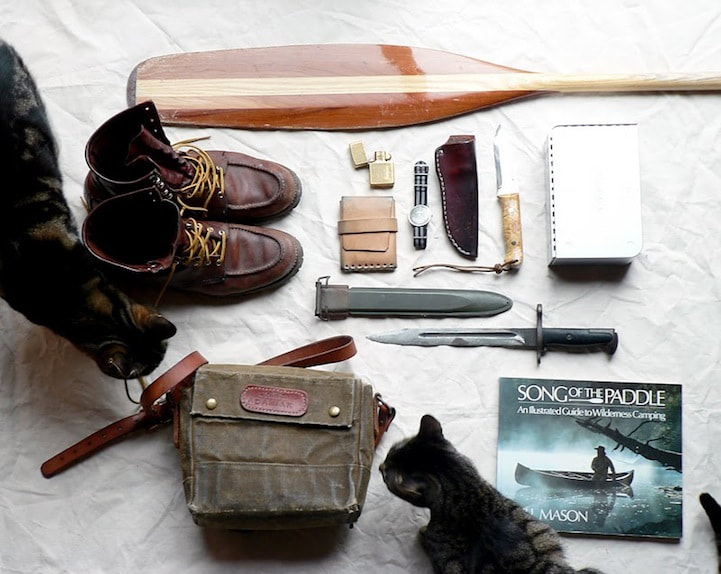
These show the diversity of people as they were all given the same task but the items people chose were just so different. Some people have gone for memories, valuables, survival gear and (of course) their pets. For example in the top left there's a lot of apple products, a guitar, wine and a pug. Whereas in the bottom right there's an oar, boots, a satchel, knives and a cat.
My Attempt
Unedited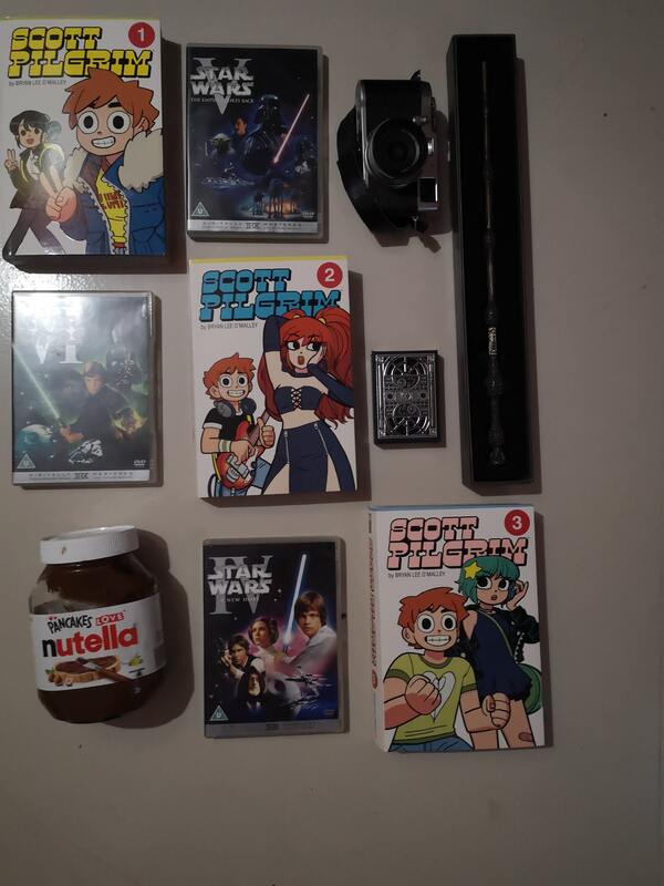
|
Edited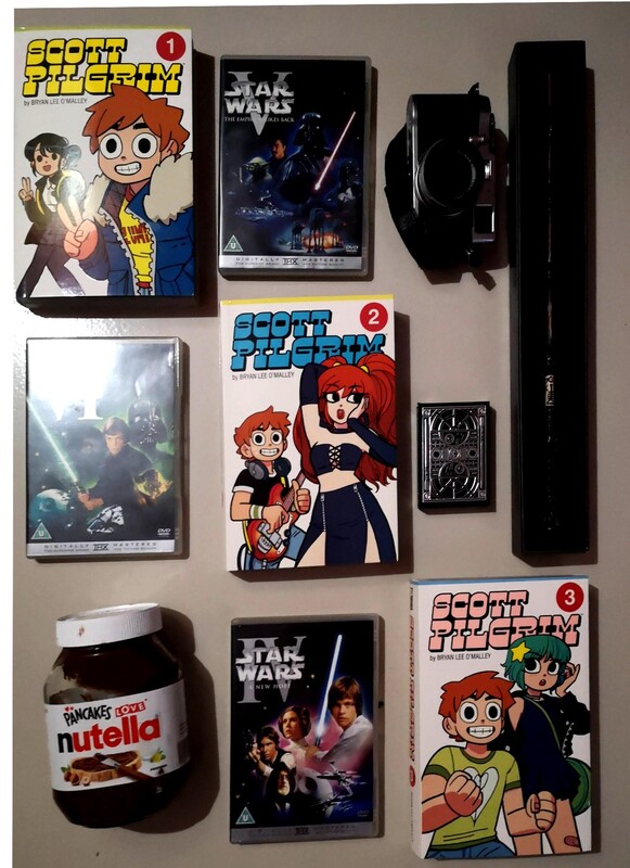
|
My Attempt 2
Unedited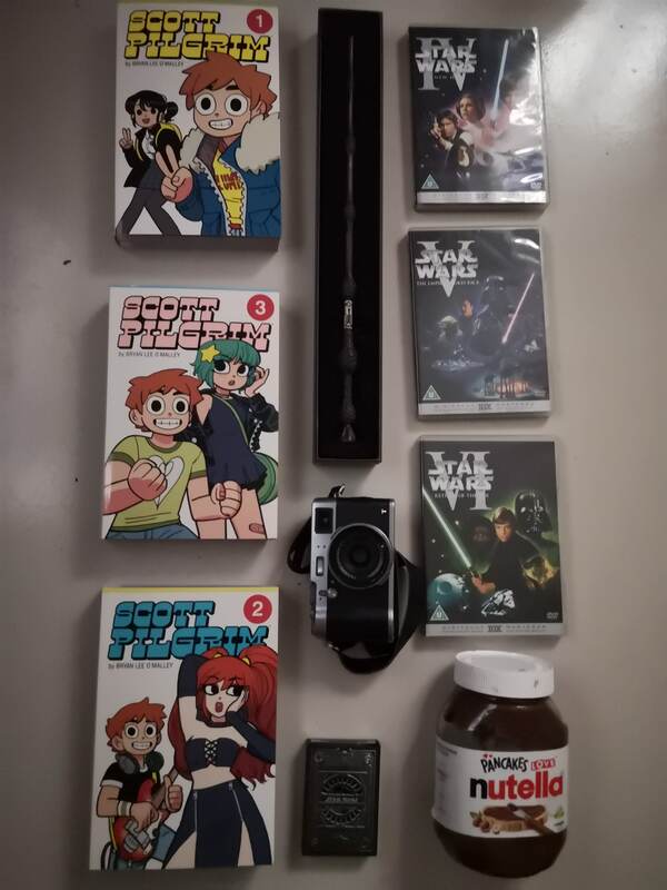
|
Edited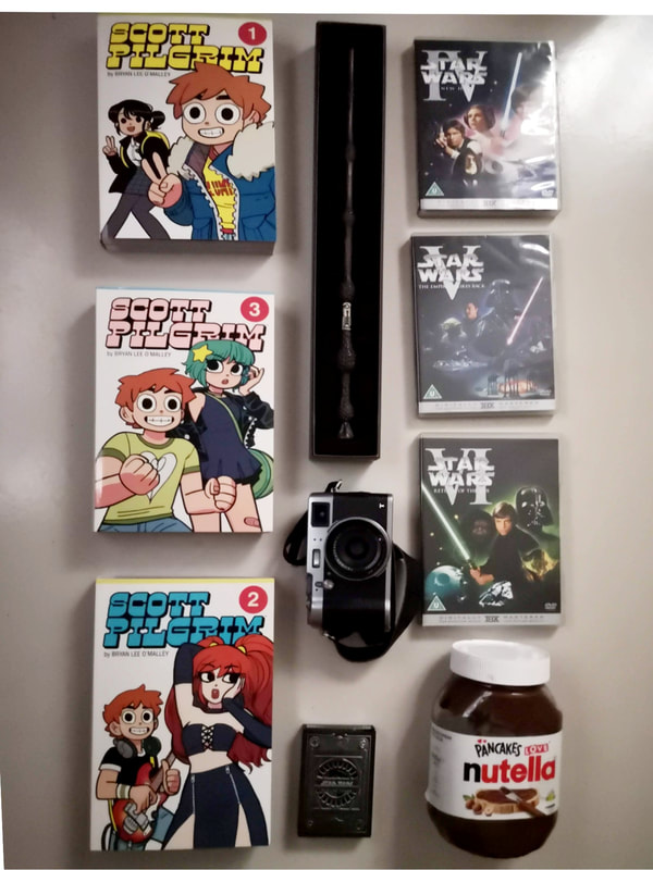
|
WWW: Blank background and colourful items
EBI: I had arranged my stuff more carefully and covered the window in my room
EBI: I had arranged my stuff more carefully and covered the window in my room
Analysis
In this project Robert Holden wanted to make people think about what is most valuable to them and more often than not a number of the items had sentimental value as opposed to material value. The concept for this project is so interesting as you see the contrast between what people would take with them and shows what different objects have value for different people and the most valuable of which is usually something small and inexpensive. Its also interesting as it shows what people think will happen to them after as some choose survival equipment as if they're going to have to live in the wild whereas some just take what's most valuable.
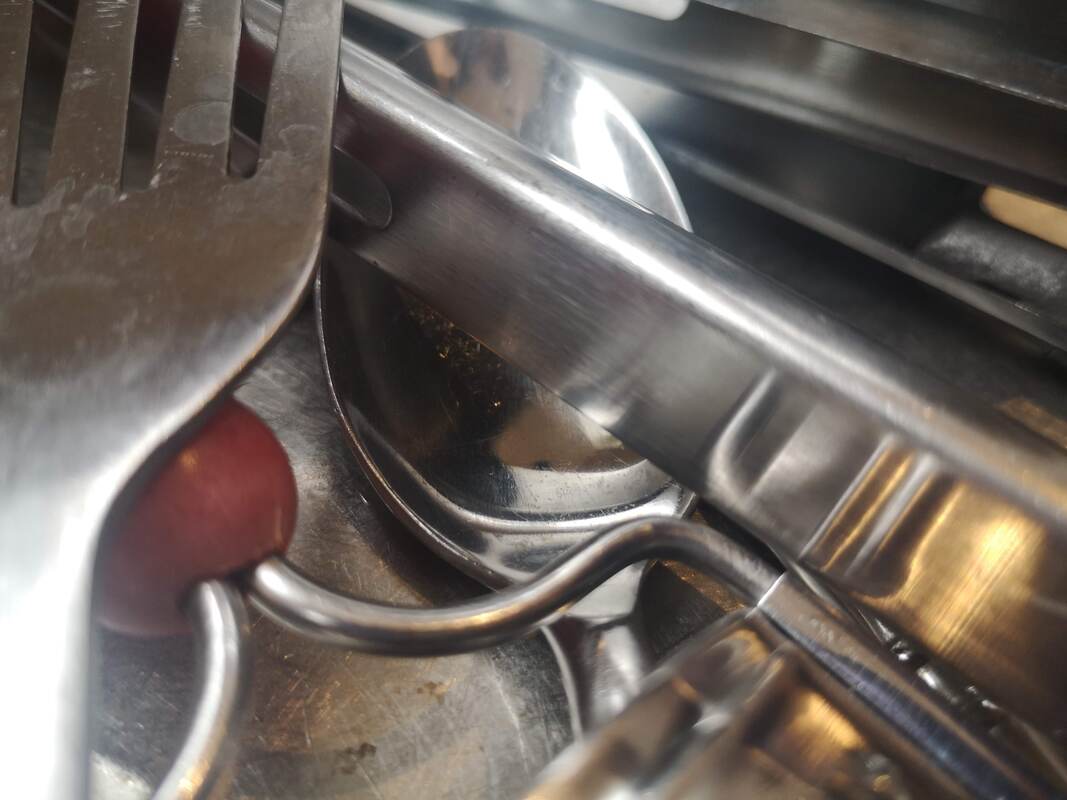
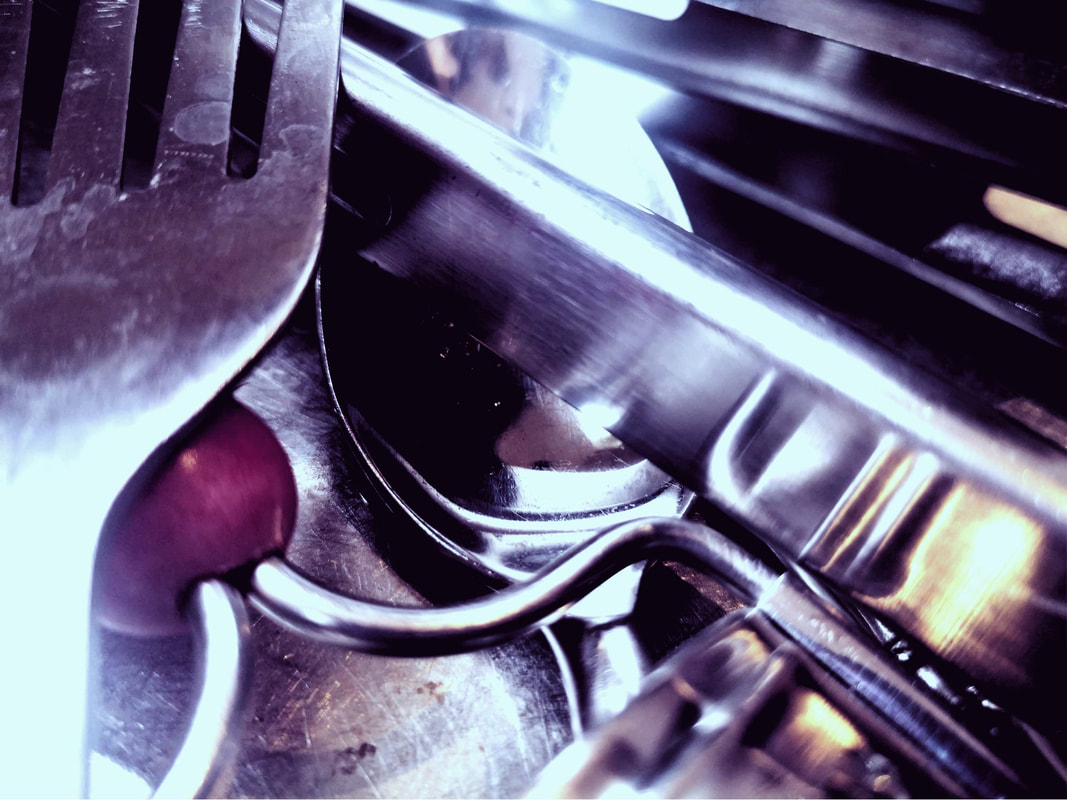
Jan Groover- Kitchen Sink


Analysis
Jan Groover creates images of shiny utensils from weird angles. She does this by positioning her camera in a way that it seems she's in the sink. I don't think she was trying to achieve deeper meaning through these photos as I don't think utensils no matter how arranged symbolise anything or have a greater depth.
The analysis I've been tasked with doing is based off the facts that there is more to the photo than meets the eye but in photography perspective is important and from my perspective I don't see anything other than the photo. Furthermore I don't think there needs to be depth to all photos and you can take photos in certain ways to be creative and fun.
However this could be reference to the work of Matha Rosler who worked around the same time by taking photos of herself in the kitchen which presented the issue of gender expectations. But I think that would be reaching a bit far.
This is a slightly less orthodox analysis but it conveys my honest view.
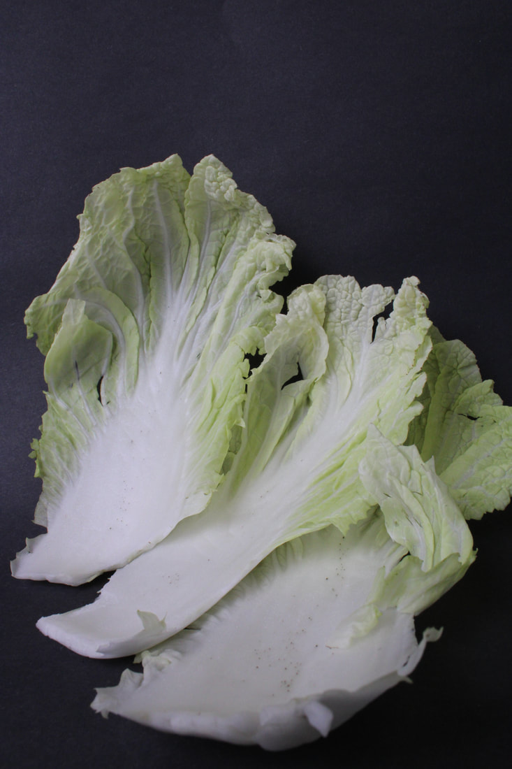
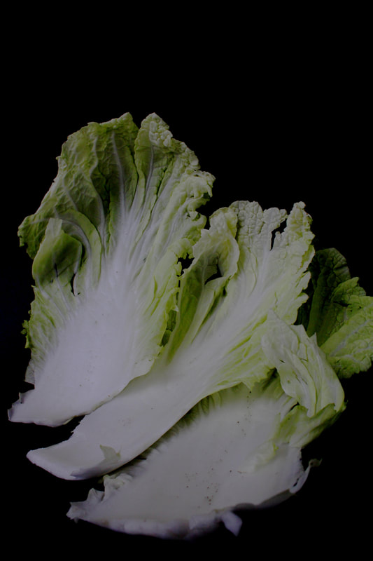
What is Groover's work about?
My Attempt
Unedited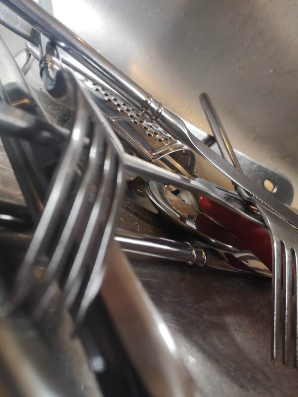
|
Edited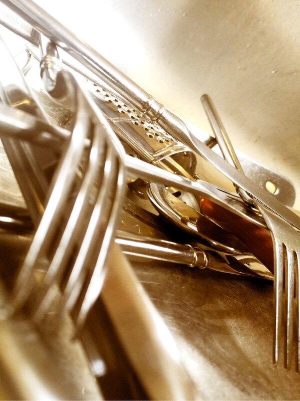
|
Form over Function
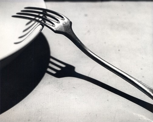
André Kertész, 'Fork', 1928
André Kertész created the image ‘Fork’ in 1928. At this time he lived in Paris where he mixed with artists from the Dada movement. This image is deliberately simple. Kertész is paying attention to the photograph’s composition emphasising the forks geometry and form. The fork becomes more than just a kitchen utensil. Kertész believed photography should reveal the real nature of things. Whilst in Paris Kertész felt like an outsider. Kertész expressed this loneliness through the subjects of his photographs. He was able to combine formal composition with an emotive charge. Henri Cartier Bresson said “Each time Kertész’s shutter clicks I hear his heart beating.
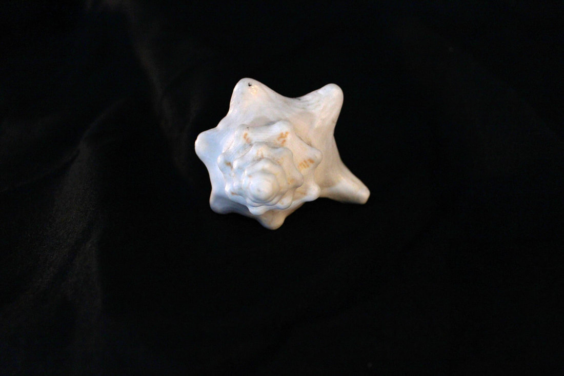
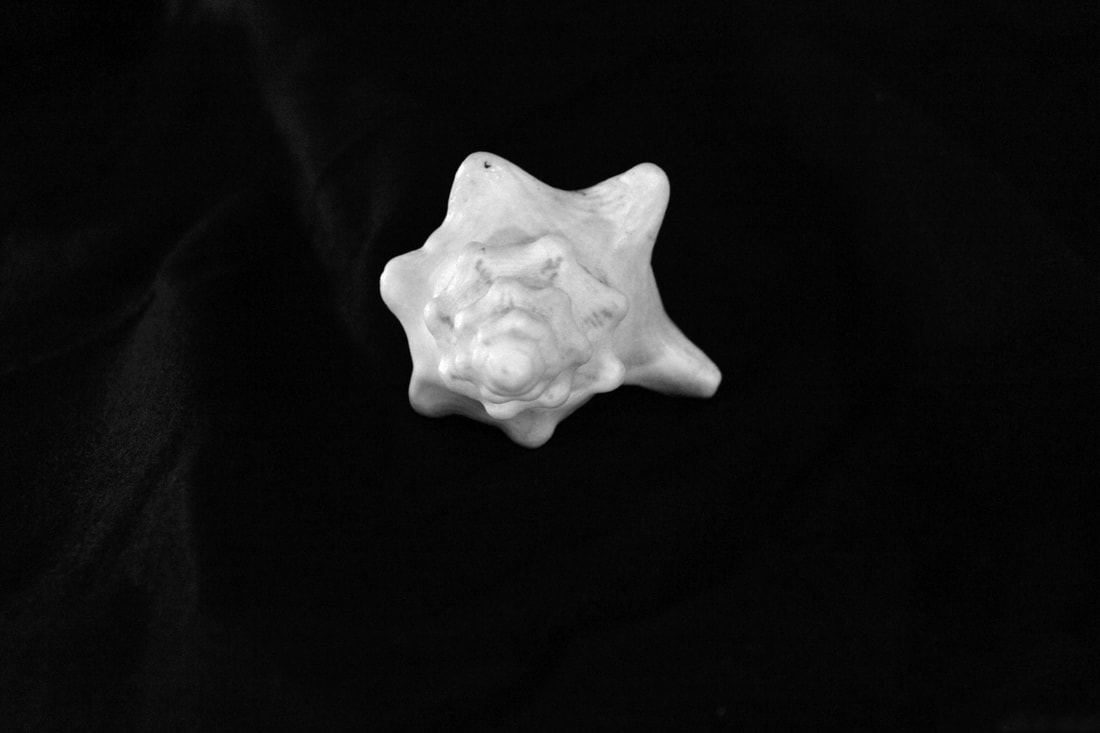
My Response
Unedited
Edited

|

|
WWW: I got some cool shadows from the forks
EBI: you weren't able to see the paper background
EBI: you weren't able to see the paper background
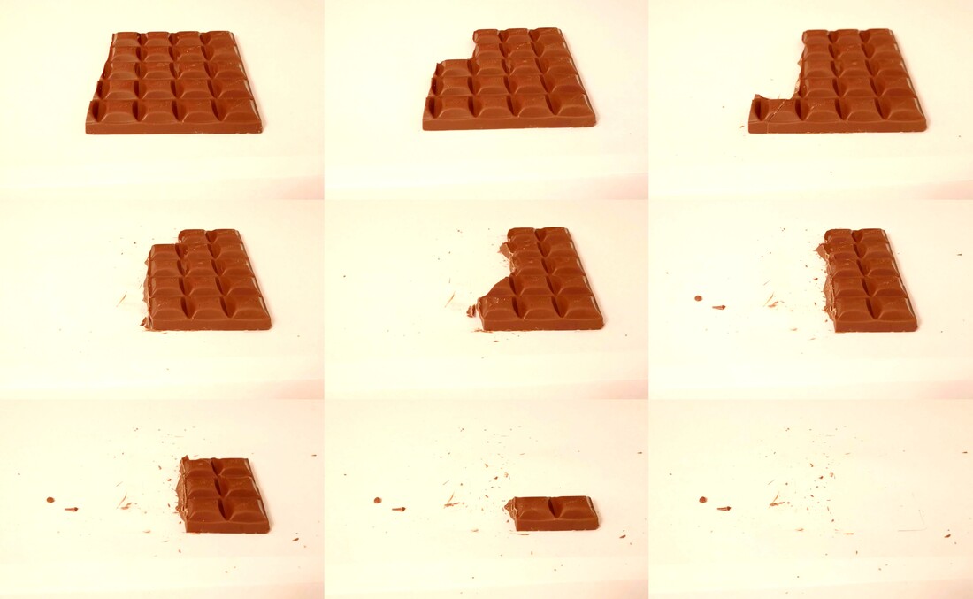
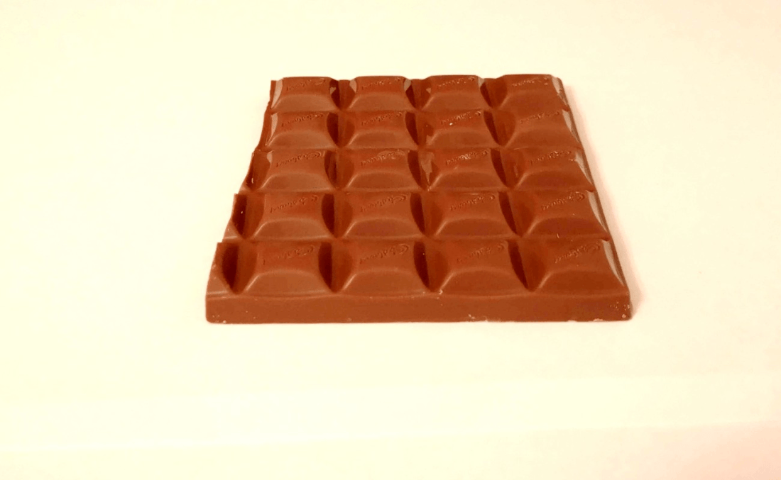
Lockdown Sequence #1
In this task I had to take a sequence of images in which I ate chocolate to then create a collage and a GIF. I chose chocolate because its easy to break and you can control how much you take off.
Unedited
Edited
Compilation
GIF
WWW: Overall I was happy with the turnout I liked how the chocolate looked after editing.
EBI: If I had kept the camera more steady and cleaned away the crumbs.
EBI: If I had kept the camera more steady and cleaned away the crumbs.
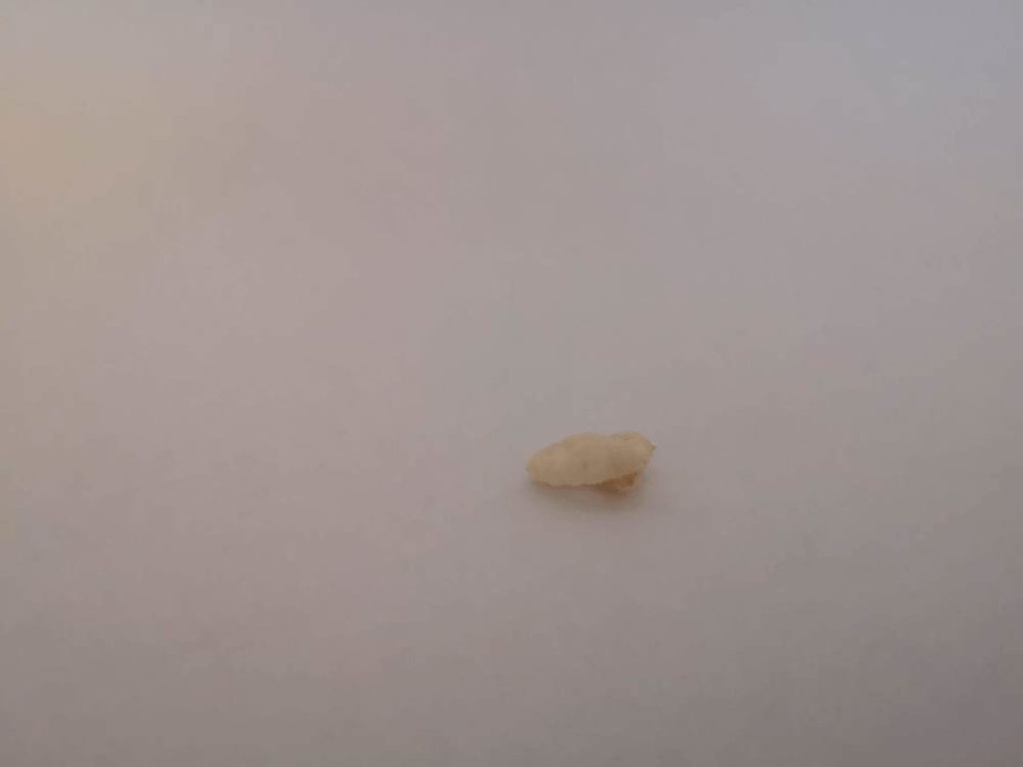
Lockdown Sequence #2
In this task I took photos of 40 individual rice crispies and then create a GIF.
Unedited
Edited
Photojoiners
David Hockney
David Hockney is connected to the Pop Art art movement. This movement was interested in responding to Popular Culture
Hockney has also created photojoiners. Photographs are taken of the same object from different perspectives. The images are then collaged to recreate the place, person or object even though they may look distorted. This work connects with the Cubist movement, one of Hockney's major aims.
Hockney has also created photojoiners. Photographs are taken of the same object from different perspectives. The images are then collaged to recreate the place, person or object even though they may look distorted. This work connects with the Cubist movement, one of Hockney's major aims.
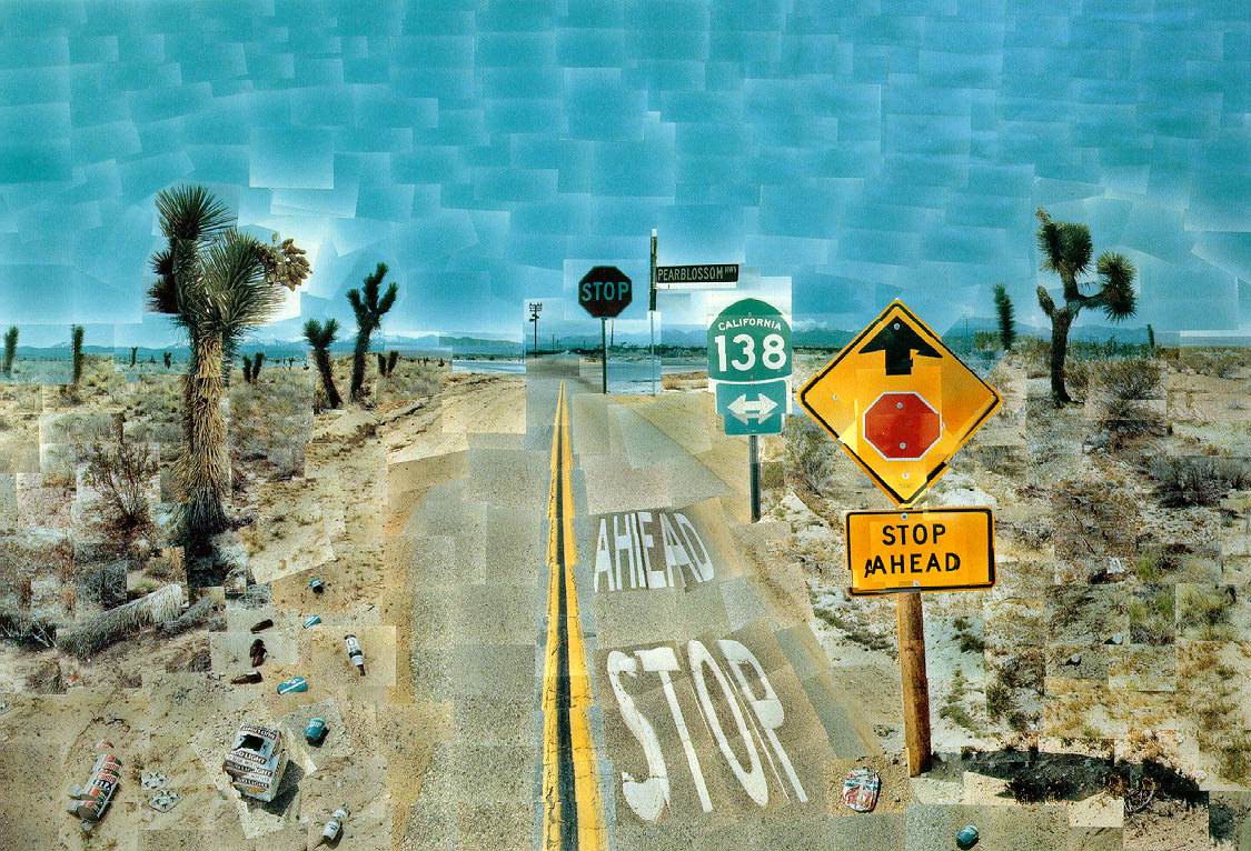
David Hockey - Pearblossom Highway (18th April 1882)
My Response
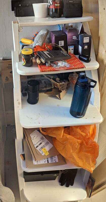
Object
Original photos
Collage
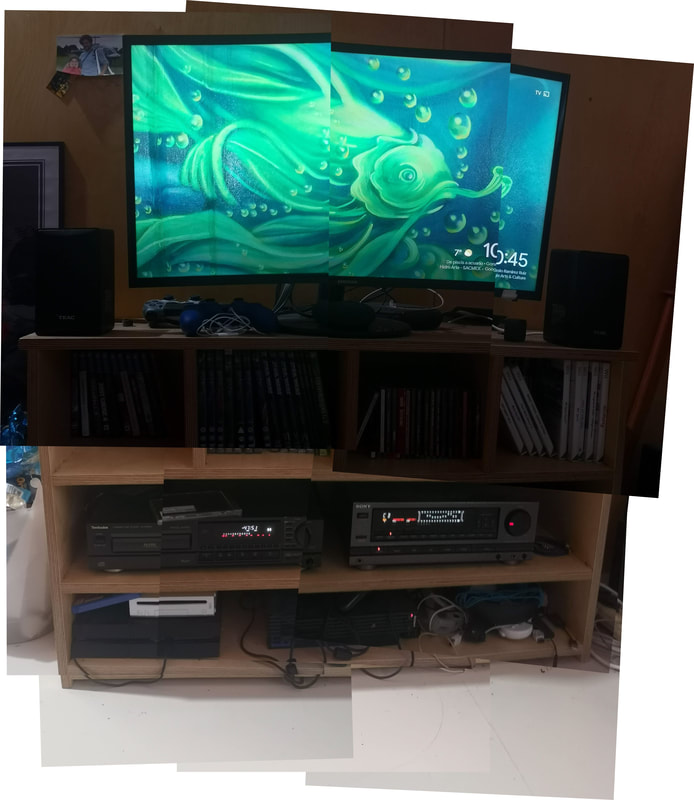
For my object I photographed a shelving unit I made for my TV as you can see it hasn't completely worked but you can still see what it is.
WWW: you can clearly see what the object is.
EBI: I had made the lighting the same throughout.
WWW: you can clearly see what the object is.
EBI: I had made the lighting the same throughout.
Corner of a room
Original Photos
Collage
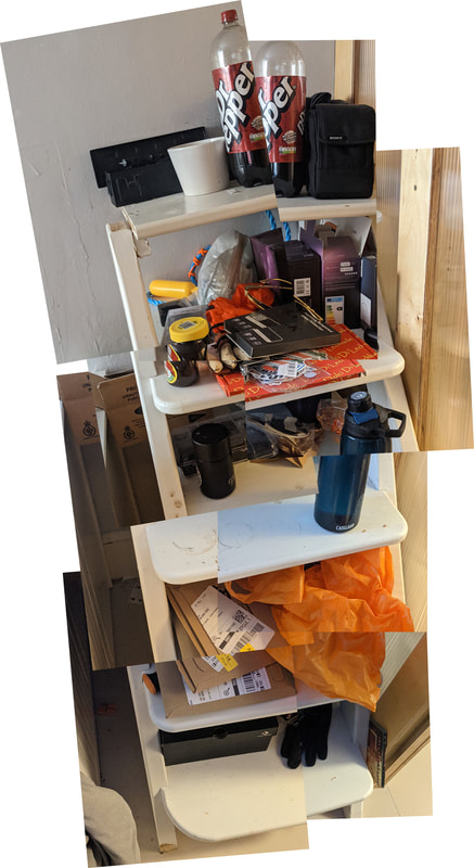
This collage was created using the collage setting on photoshop.
|
This one was created by google photos AI without my input.
|
I was tasked with doing a photo joiner of a corner of a room so I took photos of my steps that go nowhere. I have included 2 as I thought it was an interesting comparison as the one created on google photos was made by the app and is cleaner and less blocky.
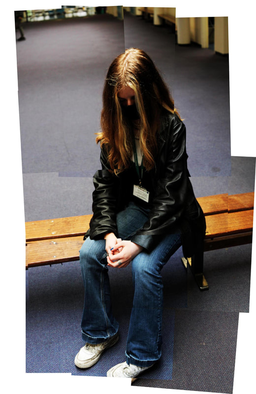
Person
In this task we had to create a photojoiner of a person so i took photos of Summer in an area with an interesting overhead light source.
Original photos
Unedited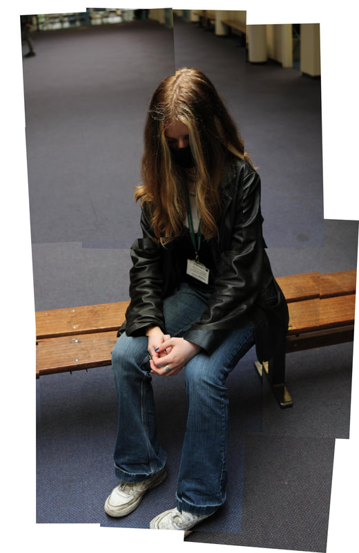
|
Edited
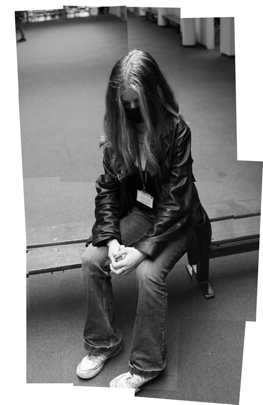
I thought it'd be a cool idea to do one in black and white so I did
|
WWW: Overall i think it was successful as the images fit together well.
EBI: If the lighting was consistent throughout all photos
EBI: If the lighting was consistent throughout all photos
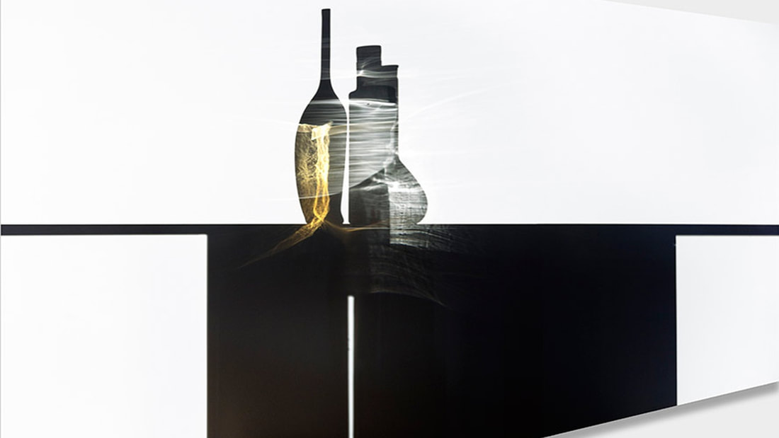
Light and Focus
Ute Barth
Ute Barth created images that only had one perspective so you would only see what she wanted you to see. She does this by positioning objects so you see their shadows, like placing bottles by a window so you see their outline on a wall. She wants us too consider what is right in front of us as she doesn't like having a hidden meaning in her photographs.
|

|
She uses techniques like a long exposure to capture the light refracted off the bottles in the most effective way. this creates an interesting effect as the solid object appears even darker but you're able to see the bottles in detail. This helps with Barth's point as there is only one way to see this photograph, the way she wants you to see it.
Intro
In this task we had to take photos in the style of Uta Barth by using shadows. This links to the theme as it utilises light and the absence of it.
My response
#1
As you can see I completely missed the point as we we're meant to use light and the absence of it. So I tried it again:
#2
This attempt went much better
Original Photos
Best edits
WWW: captured the different shades and edited well
EBI: I had added colours or objects
EBI: I had added colours or objects
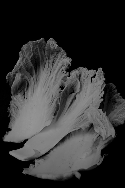
Ordinary to Extraordinary
Edward Weston
|
Edward Weston used a Graflex as it allowed him to see the image before he took it. He had created his own photographic language and everything he did had to be perfect and precise. As he was photographing the pepper he encountered the issue that the closer he got the lower the depth of field shrinks, he got around this issue by creating his own aperture size - f240 -and exposing it for 4-6 in a funnel with natural light. The use of natural light gives the pepper a luminous quality due to the shadow moving throughout the day.
|
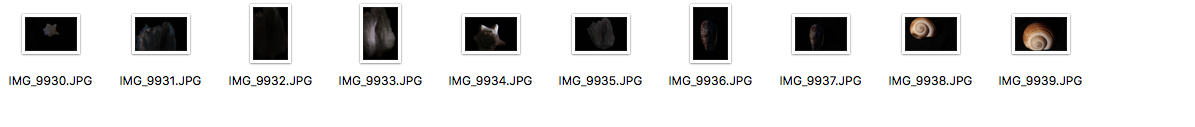
My Response: Natural Light
In this task we had to take photos in the style of Edward Holden by using natural light
Unedited
|
Edited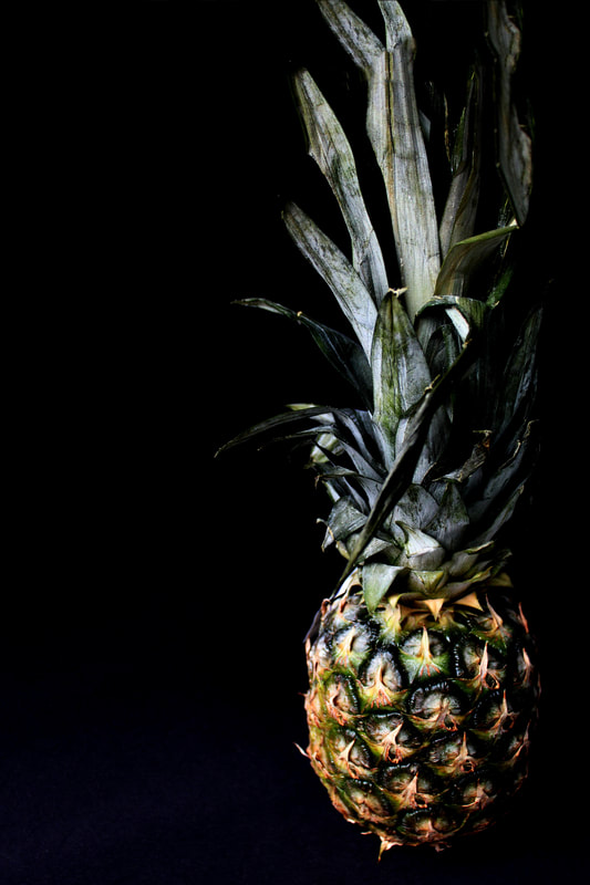
|
Black and White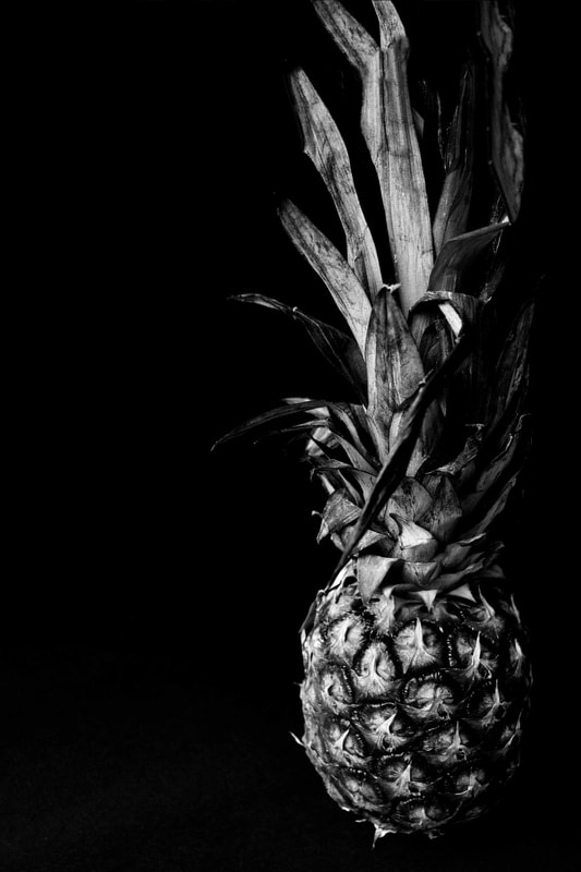
|
WWW: I did the edits well as the background virtually invisible
EBI: I had done sections as well
EBI: I had done sections as well
My Response: Artificial Light
This task was similar to the one before but we used artificial light.
Include a screen grab of all the images (see above)
Unedited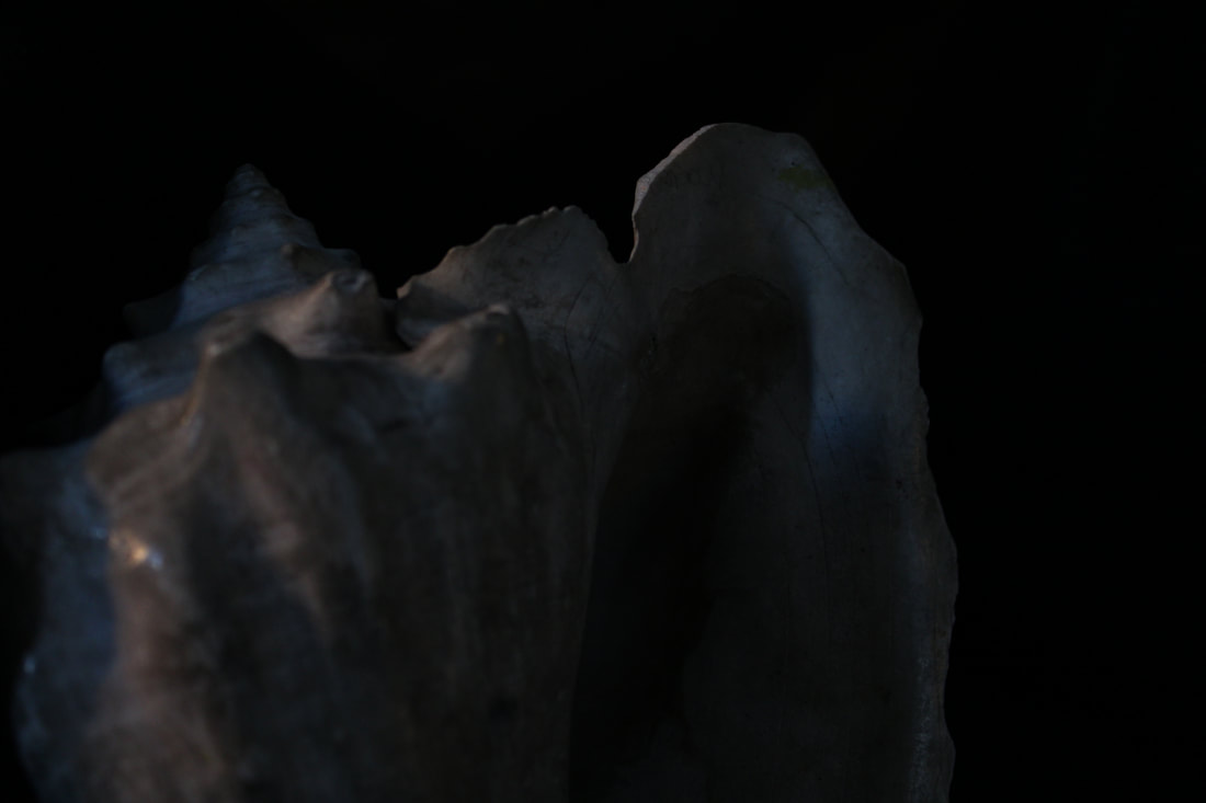
|
Edited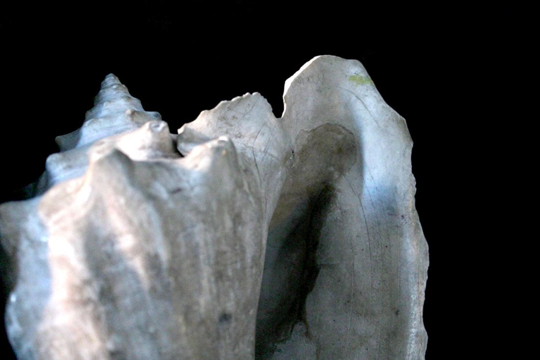
|
Black and White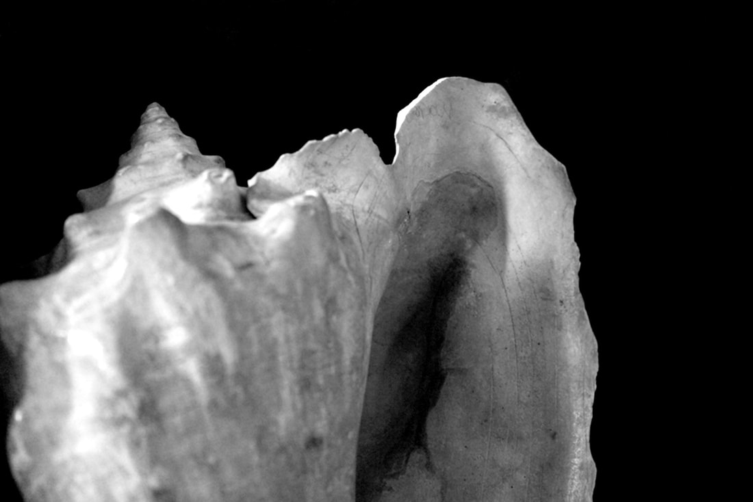
|
WWW: The edits work well and the background is virtually non-existent.
EBI: I had captured more colours and edited less.
EBI: I had captured more colours and edited less.
Independent Development
This task was an extension of the David Hockney photo joiners in which I created a collage of my house. My aim was to be experimental with the editing and seeing how far I could go.
Original Photos
Edits
Original |
Best Edit |
|
The photo generated by photoshop with no changes.
Black and White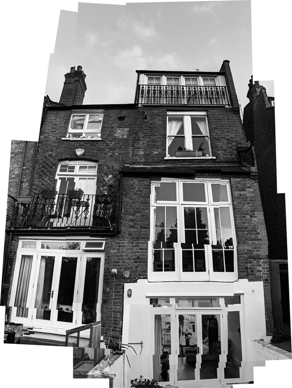
This photo was edited and then transformed into black and white.
|
This photo is my edit and I'm happy with the finished product.
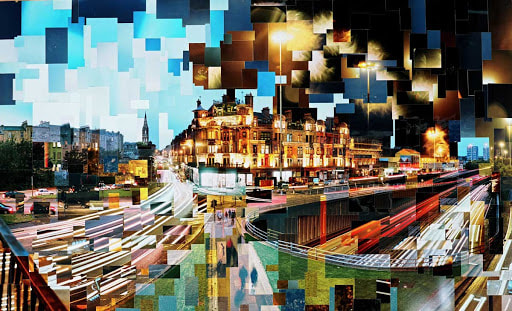
Over Edited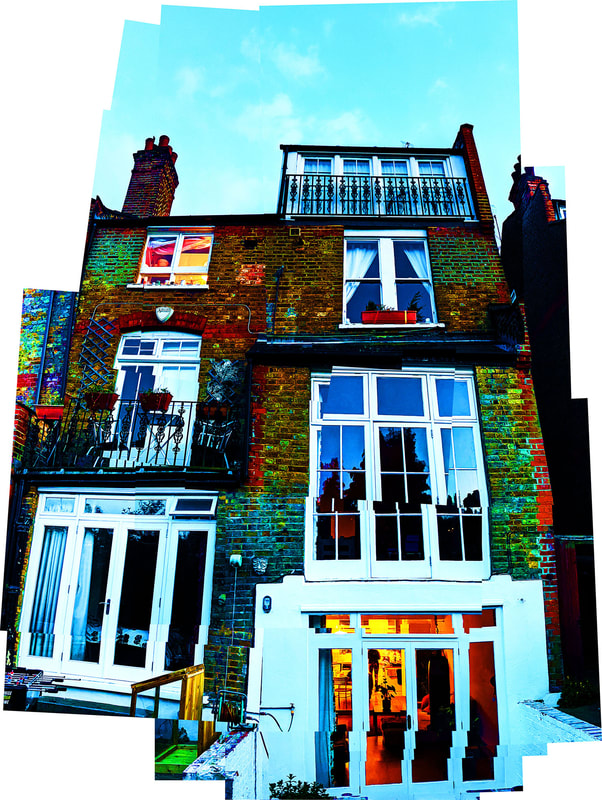
I wanted to see what would happen if I over edited the image and the result was... interesting.
|
WWW: The colours on the edit are vibrant and the sky looks turquoise.
EBI: The individual photos had aligned smoother.
EBI: The individual photos had aligned smoother.
What's Next...
Attempt a photojoiner that has images from different times of day. Look at the work of Adrian Brannan.
Attempt a photojoiner that has images from different times of day. Look at the work of Adrian Brannan.
|
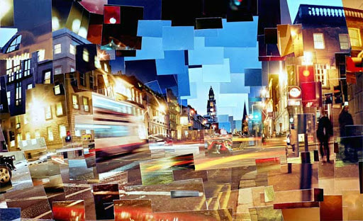
|
ANNOTATION SUPPORT
DO NOT DELETE: COPY AND PASTE SENTENCE STARTERS AS AND WHEN YOU NEED THEM
ANNOTATION
INTRODUCING A TASK
Subject matter
Subject matter
DO NOT DELETE: COPY AND PASTE SENTENCE STARTERS AS AND WHEN YOU NEED THEM
ANNOTATION
INTRODUCING A TASK
- In this task I was required to…..
- This task links to the theme as it shows....
Subject matter
- The subject I chose to photograph suited the theme as it……
- My composition helped to support my response to the theme by….
- I managed the exposure very well. My ISO / shutter speed / aperture settings were…..
- I prioritised my shutter speed to… (capture movement / blur/ frozen moment)
- I prioritised aperture to manipulate depth of field.
- I used a tripod to avoid camera shake.
- My images express my intentions which were…
Subject matter
- The subject I chose to photograph did not necessarily fit the brief
- The person / object / location was not interesting enough / appropriate / adequately lit…..
- My images do not show my intentions which were…
- The concept wasn’t clear in my images, I need to make it more explicit by…
- The location / time of day was not appropriate for the task.
- The compositions of my images did not show….
- I did not create enough depth of field / sense of movement.
- The image is overexposed / underexposed / too blurred.
- My images do not show my intentions which were…
- The concept wasn’t clear in my images, I need to make it more explicit by…
- Next time I will look at the work of (a photographer) to inspire a more accurate depiction of what I want to achieve.
- To improve my images I will experiment further with… (blur / shutter speed / composition)
- Next time I should use a tripod / use a different type of lens (be specific) / experiment with film…
